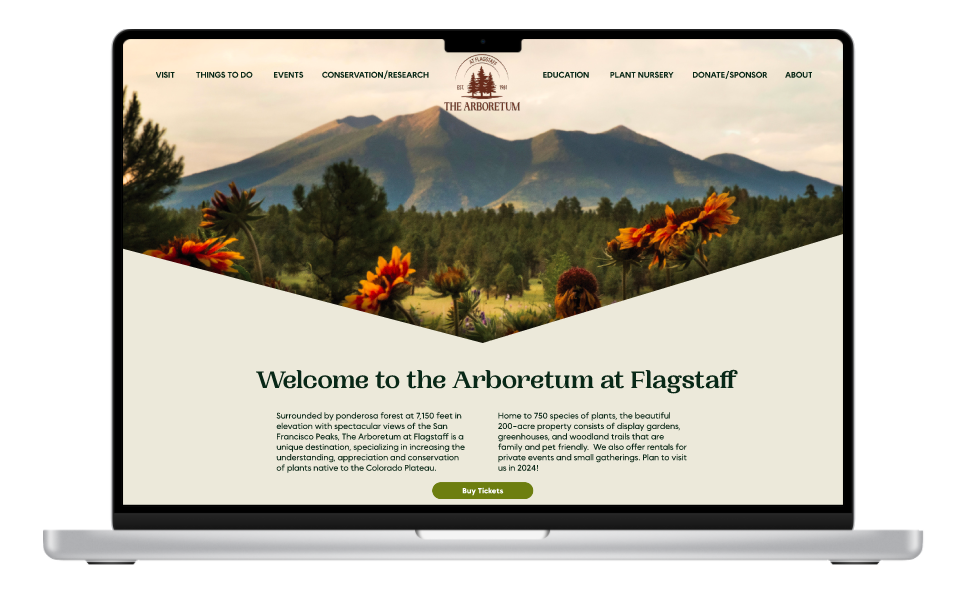
The Arboretum at Flagstaff: Sometimes you need a little sprucing up.
The Arboretum at Flagstaff is a beautiful local Arizona treasure. My goal was to help improve the user experience to turn website visits into measurable user interactions.
Background:
Surrounded by Ponderosa forest at 7,150 feet in elevation with spectacular views of the San Francisco Peaks, The Arboretum at Flagstaff is a unique destination, specializing in increasing the understanding, appreciation, and conservation of plants native to the Colorado Plateau.
The website did not reflect the level of care and consideration The Arboretum takes in preserving Northern Arizona plants and wildlife.
My goal was to make visual and navigation changes that would greatly improve the user experience. These updates would make the website more effective in promoting the Arboretum and encourage engagement from users.
Why Tackle The Arboretum’s Site?
I was initially drawn to the Arboretum's unwavering dedication to community enrichment and natural conservation. It became evident to me that the full scope of the Arboretum's offerings was not accurately portrayed by its current website. Recognizing the potential to enhance user experience and effectively convey the Arboretum's mission, I set out to modernize its design and streamline navigation.
By doing so, I anticipated not only boosting admissions, memberships, and sponsorships, but also providing patrons with a true reflection of the Arboretum's values and contributions. As a nature enthusiast and environmental advocate, my personal passion further fueled my commitment to this project.
Getting to Know the Users
User Interviews:
Conducted one-on-one interviews with 6 participants.
Initially inquired about their overall experiences with arboretums and botanical gardens to gather qualitative and quantitative data.
Observed participants interacting with the current website iteration and elicited feedback on their experience.
Pinpoint user preferences in order to address major pain points identified during the interviews.
Participants:
Participants ages ranged from 26-35
5/6 were not currently members of an arboretum or community garden.
2 participants visited 1-2 times a year.
2 participants visited 2-4 times a year.
One participant visited 4-6 times a year.
One participant visited Once a month.
What I asked:
Open-ended questions about the participant's qualitative experiences of being a patron of arboretums or gardens, as well as their thoughts on the current arboretum website.
How often they frequented arboretums or gardens, and if they were members.
What information they would expect to be able to find on the site.
About any pain points they faced while using the current site and attempting to find the necessary information.
Affinity Mapping:
What I learned:
6/6 participants listed pricing, location, and hours as the most needed information from the Arboretum’s site.
6/6 participants expressed interest in renting the arboretum for a private event or gathering.
6/6 participants noted that the current font and color choices made reading the information on the site difficult.
6/6 participants noted that the website did not look like it had been updated recently and looked dated.
5/6 participants who were not already members stated that proximity to where their biggest consideration.
Affinity mapping helped to organize the data from user interviews into actionable insights.
Competitive Analysis:
Researching other gardens and arboretums helped me understand the industry standard for the information architecture and navigation of the site.
All competitors had a horizontal navigation menu at the top of the page while The Arboretum at Flagstaff had a hamburger menu that expanded into a vertical menu.
All other companies’ hero images/videos didn’t take up the entire above-the-fold section, allowing the user to see valuable information without scrolling.
All competitors had the location or address listed somewhere on their landing page.
3/4 of the competitors had a CTA Button in their hero section, easily guiding the user to a key action.
What I learned:
Finding Direction for the Project
From the research I came up with the following POV and HMW statements:
POV
I'd like to explore ways to redesign the Arboretum website to improve user experience and increase the number of annual visitors, as the current version is dated, lacks vital information on the homepage, and fails to engage visitors effectively.
HMW
How might we redesign the Arboretum website to provide a modern and engaging user experience, while ensuring that all vital information is prominently featured on the homepage?
Creating User Personas Helped to Make Decisions with Empathy:
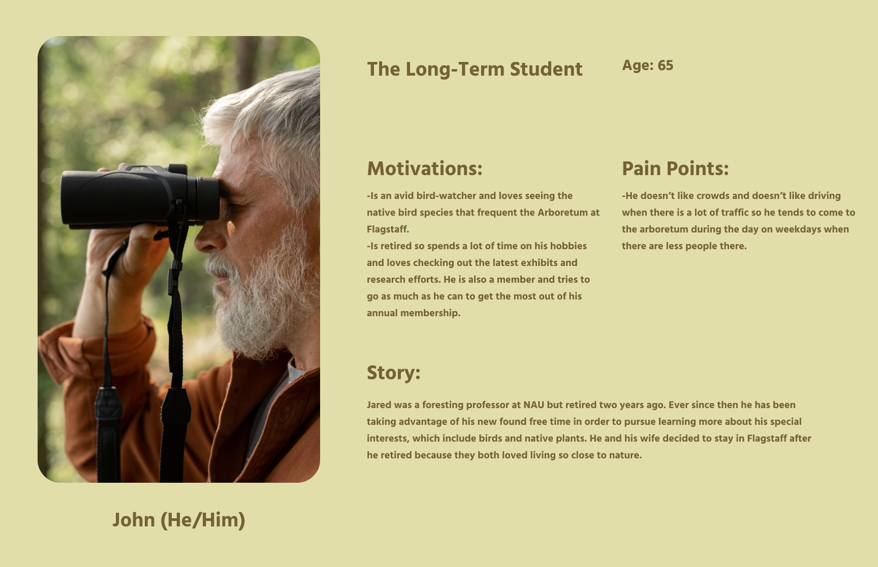
The user personas I created were derived from the stories and experiences shared with me during the user interviews. This helped me reflect during the design process on how different users would use the product and ensure it was accessible to many potential users.
Project Goals and Prioritization:
To create the best possible product, it was crucial to consider both the user goals and business objectives. Finding a way to align these two sets of goals helped create a product that is functional and successful in meeting the needs of the user while also driving business objectives forward.
Site-Mapping:
Creating a site map helped me visualize the organization of the site before diving into the sketching process, which allowed me to enter the design phase with more confidence and direction.
Figuring out which features of the design to prioritize:
To guide feature prioritization, I carefully analyzed insights from user interviews, pinpointing essential screens and functions vital for completing prevalent tasks on the Arboretum's website.
This method enabled me to prioritize features that would increase patronage of the arboretum such as a newsletter sign-up, purchasing tickets or a membership, and requesting a quote for a private event.
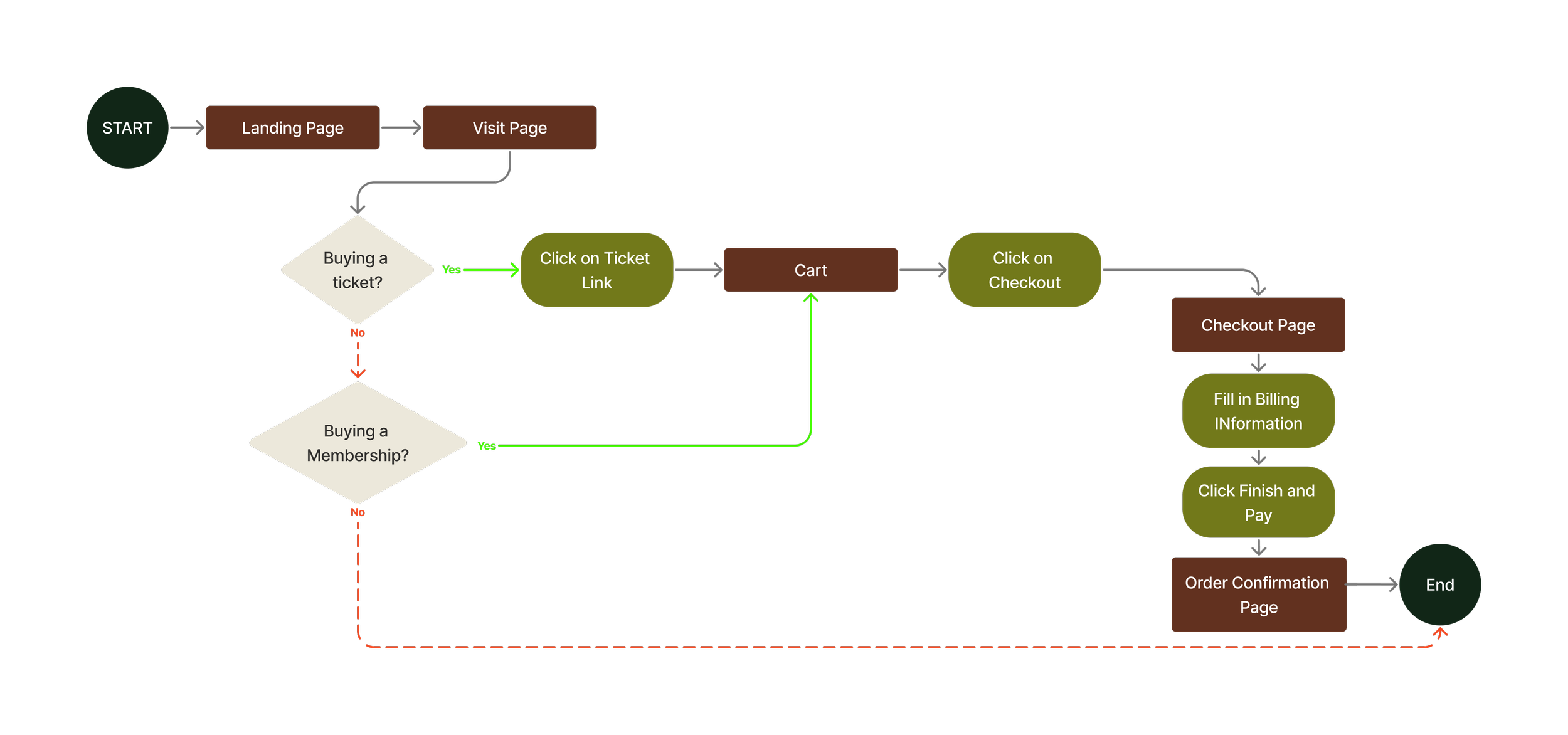
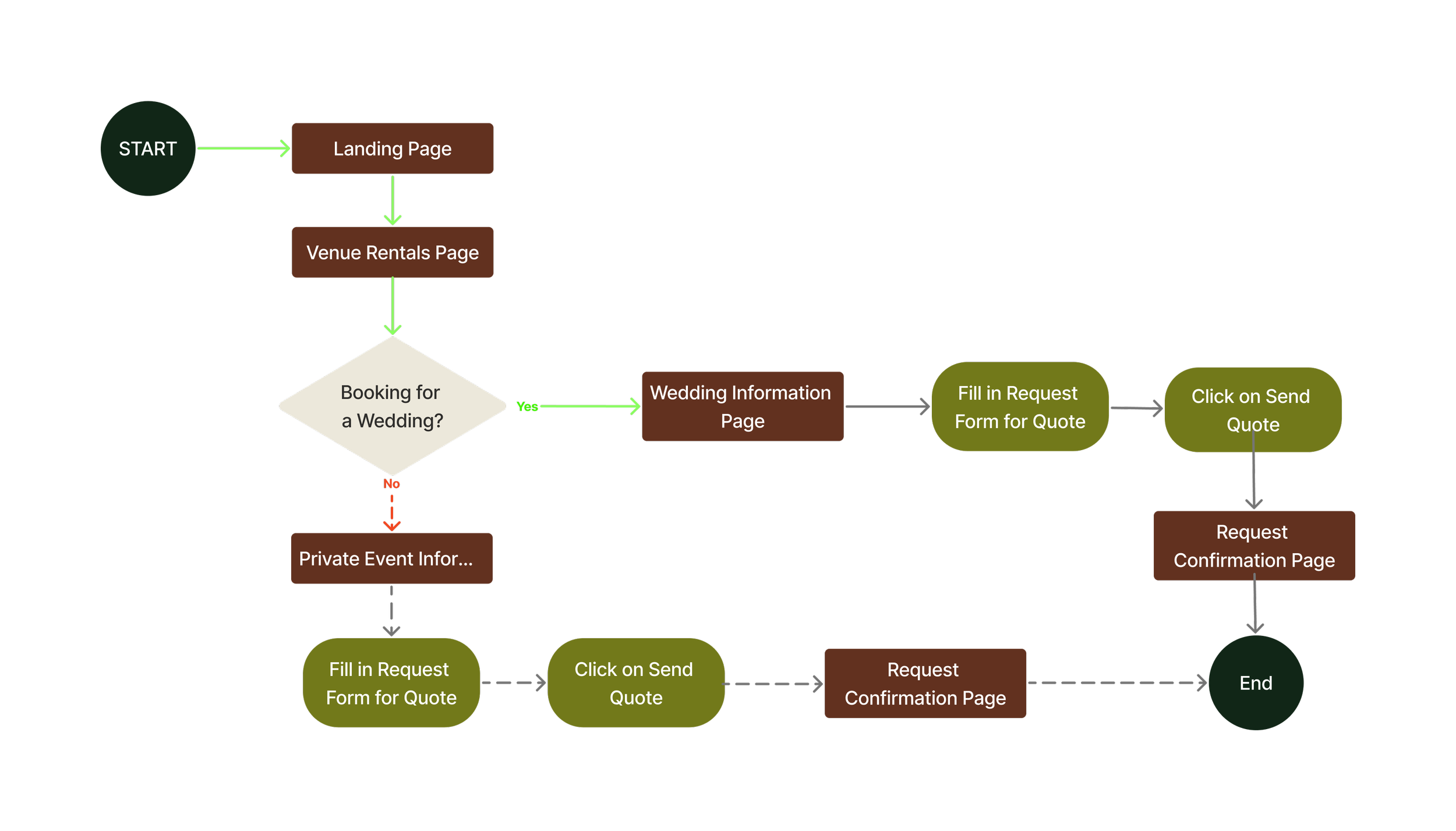
Creating the user flows helped to determine how users might interact with the information architecture, including all the possible paths users could take to get to the same destination. I explored the user flows of the ticket and membership purchasing process and how a user would go about requesting a quote for a private event because they are the actions that would require the most engagement from the users and would encourage patronage to the arboretum.
User Flow: Buying a Ticket or Membership
User Flow: Requesting a Quote for a Private Event
After creating the user flows, I created task flows that depict the optimal path potential users would take. These task flows were used to test the product during the user testing phase. The additional task flow of the newsletter sign-up wasn’t originally included in user flows because there is only one possible path a user can take while moving through that flow.
Task Flow: Newsletter Sign-Up Flow
Task Flow: Ticket/Membership Purchasing
Task Flow: Requesting a Quote for a Private Event
Starting the Design Process
Sketching out the Possibilities:
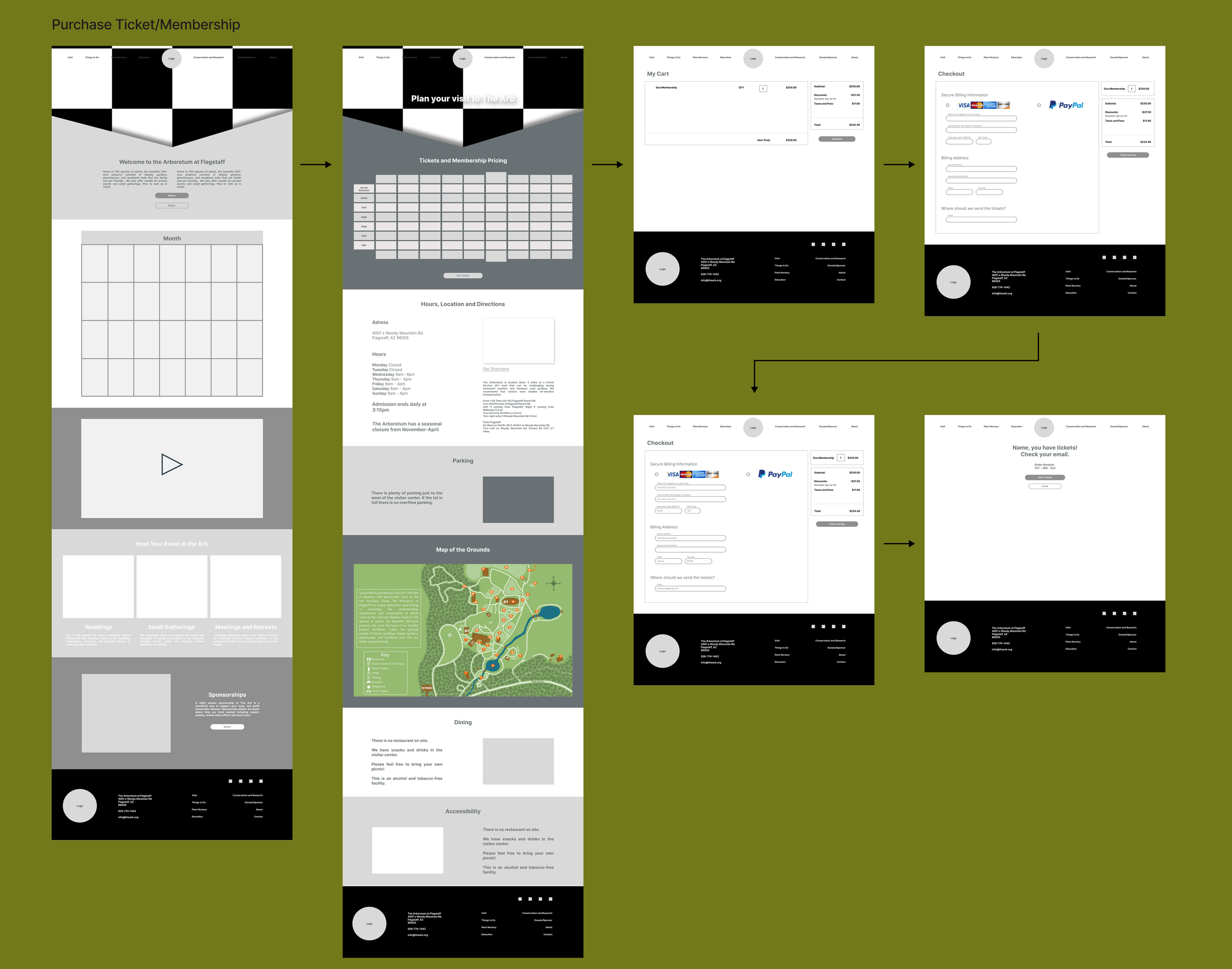
Utilizing insights from both competitive analysis and user interviews, I sketched layout ideas to emphasize key features in my design. This process enabled me to visualize the user interface, ensuring a cohesive design transition. Moving from sketches to low-fidelity wireframes, I mapped out screen layouts, addressing potential navigation and user flow issues early in the design process.
Mid-Fidelity Wireframes:
As I progressed to mid-fidelity prototypes, I digitized my initial low-fidelity sketches. During this phase, adjustments were necessary to accommodate grid patterns and spacing requirements, ensuring optimal layout consistency and user experience.
Branding
Design Inspiration:
Drawing inspiration from the rich heritage and natural beauty of the Arboretum, my goal was to create a design that embodied warmth and history. By infusing elements that evoke feelings of trust and a sense of a well-established facility, I aimed to convey the Arboretum's commitment to natural conservation and education. Through a harmonious blend of rustic textures, earthy tones, and timeless aesthetics, my design decisions capture the essence of the Arboretum's legacy while inviting visitors to explore and connect with its enduring mission.
Drawing from the natural allure of the Arboretum, the design ethos is steeped in tradition and organic charm.
The logo embodies timeless sophistication, featuring Northern Arizona soil-inspired hues that reflect the Arboretum's deep-rooted connection to the environment.
Thoughtfully chosen fonts exude a sense of established credibility, ensuring legibility while conveying a sense of trustworthiness.
Major components such as buttons, form fields, and icons were crafted to seamlessly integrate with the overall aesthetic. Each element is carefully considered to provide a cohesive and welcoming user experience, inviting visitors to effortlessly engage with the Arboretum's mission and offerings.
High-Fidelity Wireframes
Getting Feedback from the Users:
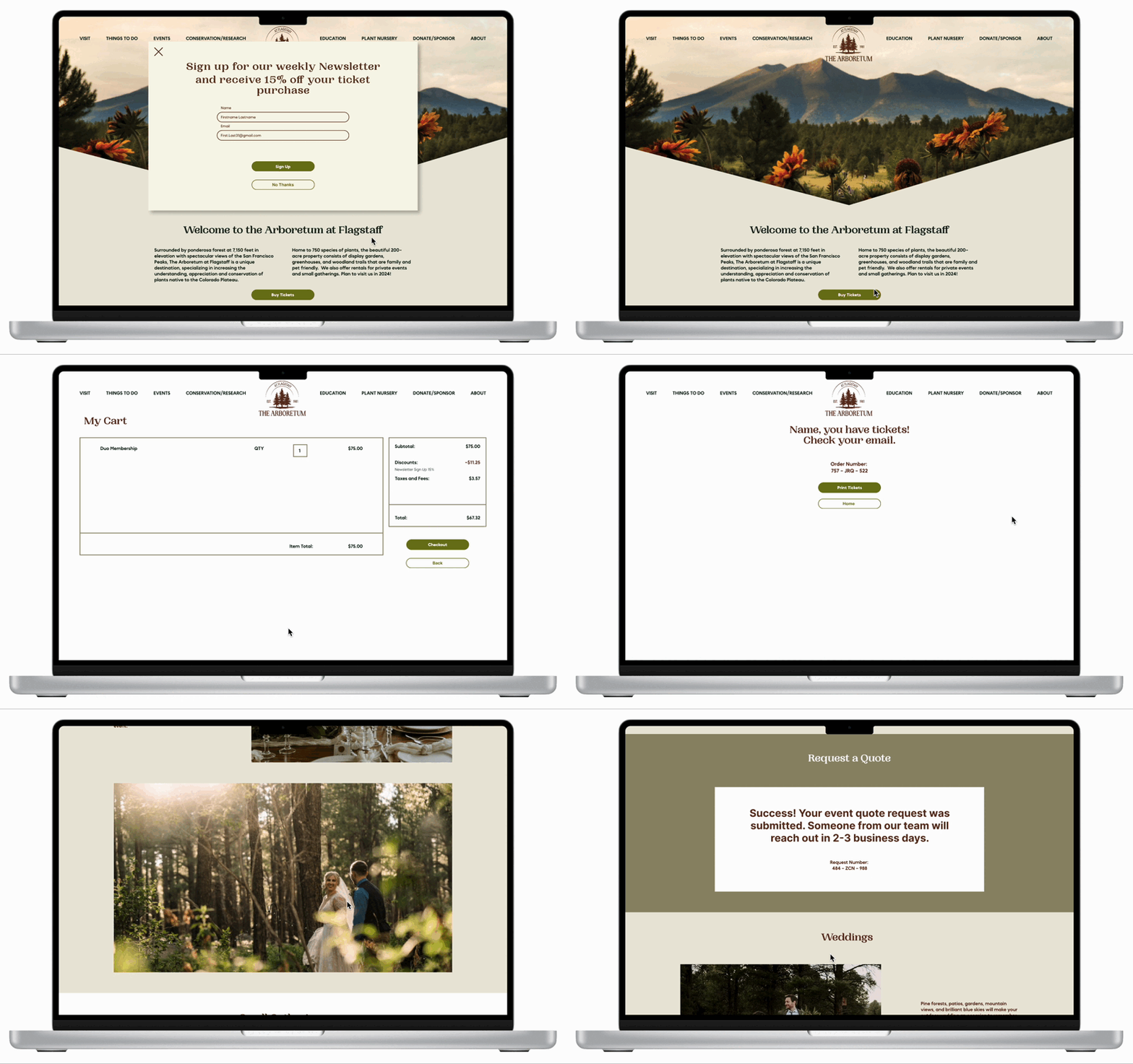
The Prototype Used for Testing:
Users were asked to complete these three tasks during user testing:
Sign up for the Arboretum newsletter
Purchase a yearly membership
Submit a quote request for a private event
Usability Testing and Priority Revisions:
Methodologies: The usability test will be moderated and will be held virtually in Google Hangout or in person. Each test took about 20 minutes to complete.
Goal: Completing user testing will help The Arboretum at Flagstaff to determine if the design goals made during the research phase helped improve the overall usability of the site.
Objectives:
Observe how users interact with the updated website prototype.
Gain qualitative feedback about the user’s experience.
Use the results of the test to validate design decisions and make any necessary iterations.
Summarizing the Results from User Testing:
6/6 Users responded positively to the visual rebranding.
6/6 Users stated they would be excited to visit the Arboretum based on the website alone.
6/6 Users were able to complete the three assigned tasks without error.
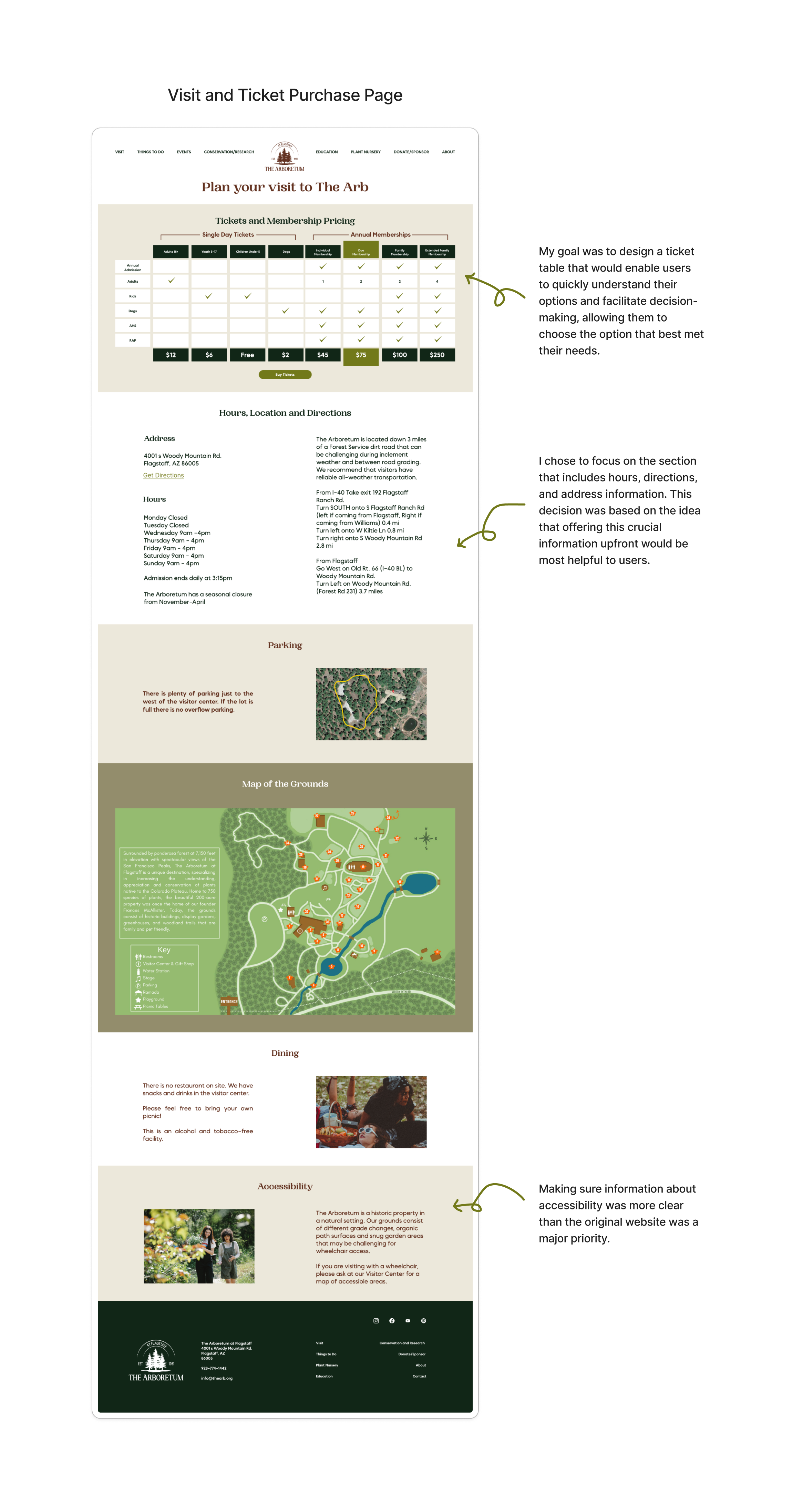
Taking What Was Learned from Testing and Putting it to Action:
While parameters of difficulty and importance were utilized for the case study's purposes, it's crucial to note that in a real-world setting, an additional parameter such as cost-effectiveness or likelihood to result in conversion would be incorporated.
This ensures a more comprehensive evaluation of design decisions, aligning them with practical considerations for maximizing returns and achieving tangible business goals.
For a closer look at the priority matrix and a full list of suggested revisions click below.
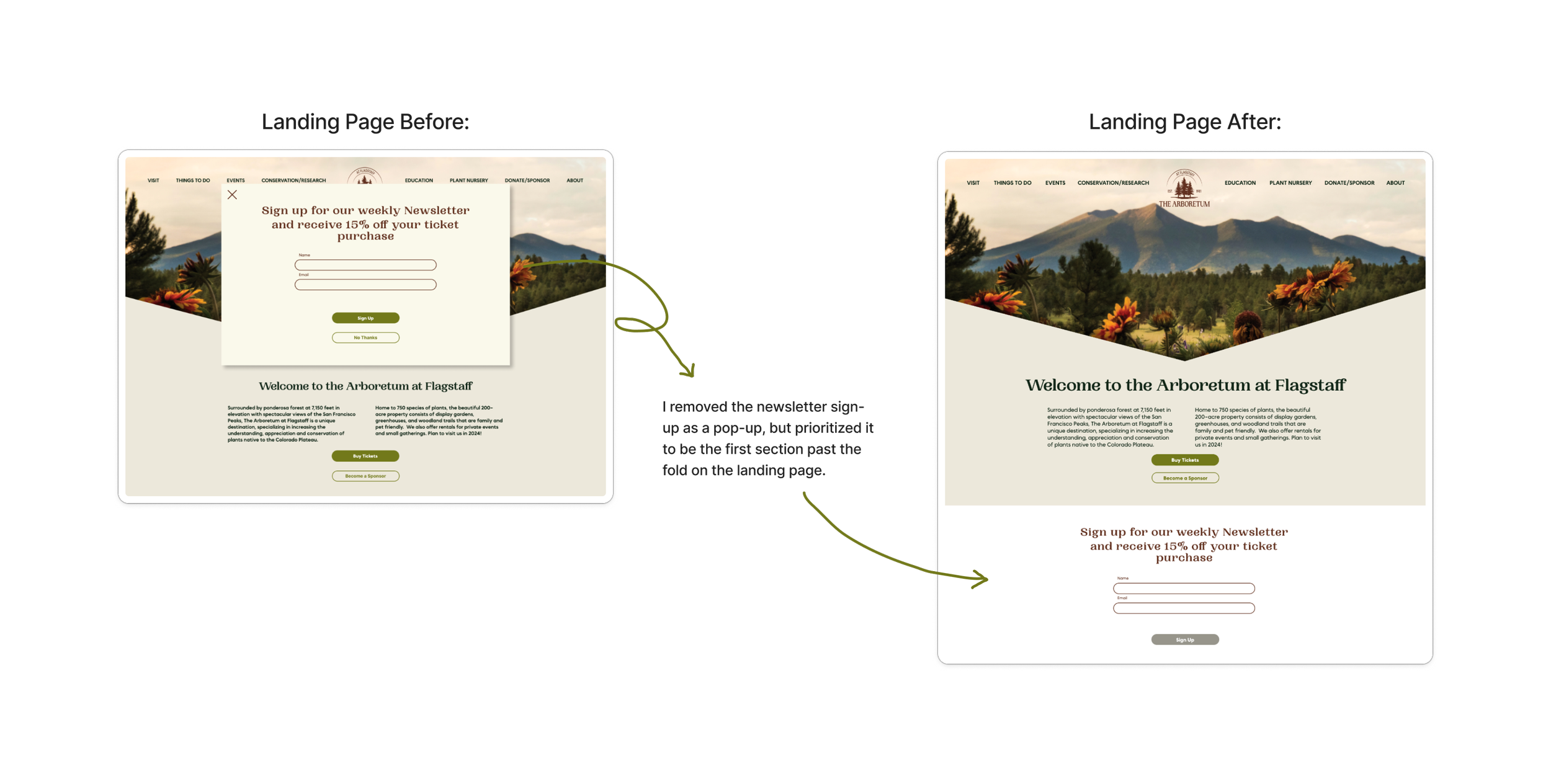
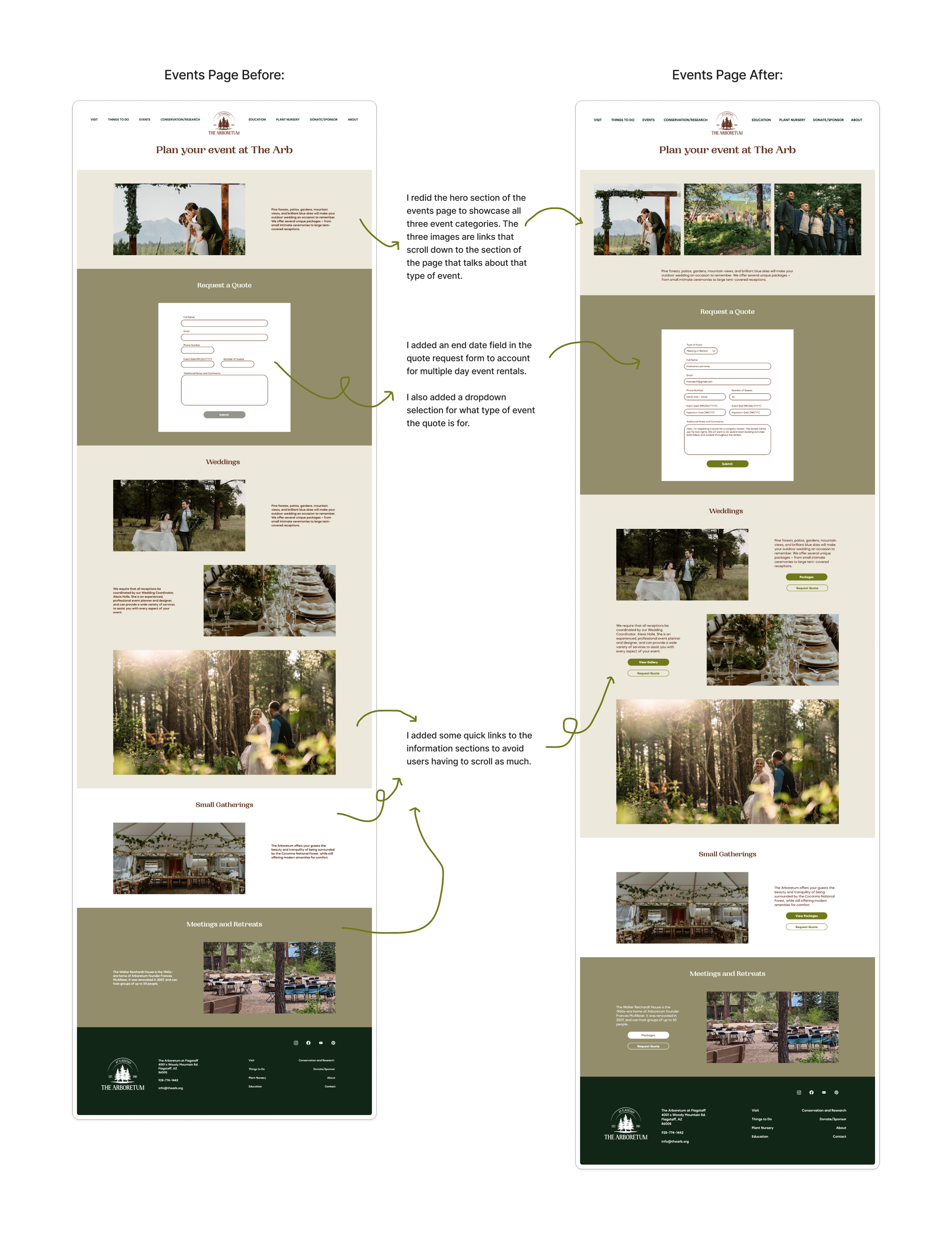
A Closer Look at Iterations:
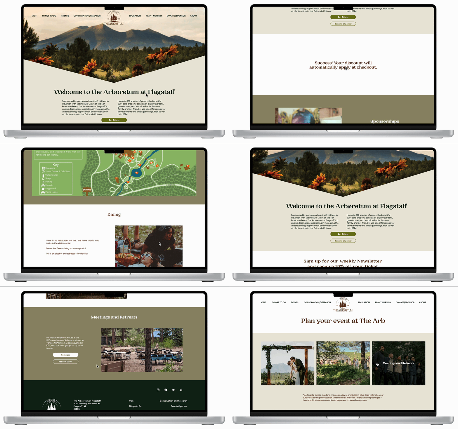
The Final Prototype:
A Reminder of Where the Design Started:
What I Learned
Through the process of redesigning the Arboretum's website, I gained invaluable insights into user preferences, effective design strategies, and the intersection of digital presence with real-world goals. I learned the importance of balancing aesthetics with functionality, prioritizing features based on user needs, and leveraging design elements to convey the Arboretum's mission effectively.
Moving Forward:
If this project were to continue, the next steps would involve further refinement and optimization based on user feedback and data analysis. This might include A/B testing different design elements, conducting usability testing to identify areas for improvement, and continuously updating the website to stay aligned with evolving user expectations and technological advancements.
