Cocoon:
The hub for all your trans healthcare needs
A Design case study, exploring possible solutions for transgender patients to be able to track all of their healthcare, find resources, and stay connected with the community.
In recent years, there has been a growing recognition of the unique healthcare needs of transgender people. Navigating the complexities of healthcare, especially concerning hormone replacement therapy (HRT) and gender-affirming surgeries, remains a significant challenge. To address this gap and empower transgender people to manage their healthcare effectively, I proposed the development of a trans healthcare tracking app.
Why explore trans healthcare?
As a trans individual who has personally experienced the challenges of navigating the complex landscape of gender-affirming care, I embarked on this project with a deep understanding of the barriers faced by those seeking such vital healthcare services.
Recognizing the pivotal role that support and community played in my own journey, inspired me to develop a solution that could alleviate the burden and facilitate access to care for others in similar circumstances.
Through this project, I aim to leverage technology to streamline the process, offer support, and empower individuals on their path to gender affirmation.
Talking to Potential Users:
User Interviews:
I completed one-on-one interviews with participants.
I asked them questions about their process of receiving and accessing gender-affirming care.
Through the interviews, I discovered the participant's motivations and pain points.
Participants:
I interviewed 6 participants
Participants ranged from 27-33 years old
All participants had experience with gender-affirming surgery.
All participants had experience with hormone replacement therapy.
What I asked:
Open-ended questions about the participant's qualitative experiences of going through the healthcare system and attempting to receive gender-affirming care.
How they kept themselves organized throughout the process.
About their motivations and personal goals.
About any pain points they faced during the process.
What I learned:
All participants had unique experiences navigating the US healthcare system and accessing care.
All participants said that it was extremely important to them to have a strong support system throughout their journey.
5/6 participants said it would be extremely important for them to be able to get medication reminders.
5/6 participants noted that the app could help in streamlining the insurance process by offering guidance, checklists, and providing advocacy help.
4/6 participants said they would feel better about filling out personal information if there was an extra login step such as face lock or two-step authentication.
Affinity Mapping:
Affinity mapping post-user interviews unearthed recurring issues, guiding the project's purpose.
Competitive Analysis:
Not only tracks your transition but also offers a way to share progress with allies and your community.
Specifically helps trans youth get and stay connected with their healthcare providers and stay informed about sexual health.
Flo is an ovulation and period tracker app, fertility calendar, and pregnancy assistant.
What I Learned:
Two companies offered interaction with user’s healthcare providers and two companies did not.
Three companies offered ways to track progress on specific healthcare related topics such as stroke recovery, pregnancy and Hormone Replacement Therapy.
The main gap I found was assisting users with navigating insurance approvals.
Studying competitors offered profound insights into established solutions, enriching my approach and bolstering the project's impact. It enabled me to identify areas where current solutions fall short and focus on addressing the unmet needs of our community.
Finding Direction for the Project
From the research I came up with the following POV and HMW statements:
POV
I would like to explore ways to develop a user-friendly platform that addresses the diverse needs of transgender individuals, including appointment reminders, medication tracking, and guidance on transitioning processes while ensuring data privacy and security.
HMW
How might we improve accessibility and inclusivity in transgender healthcare tracking, ensuring that all individuals, regardless of location or resources, can easily manage their healthcare documentation and appointments while feeling supported and validated throughout their transition journey?
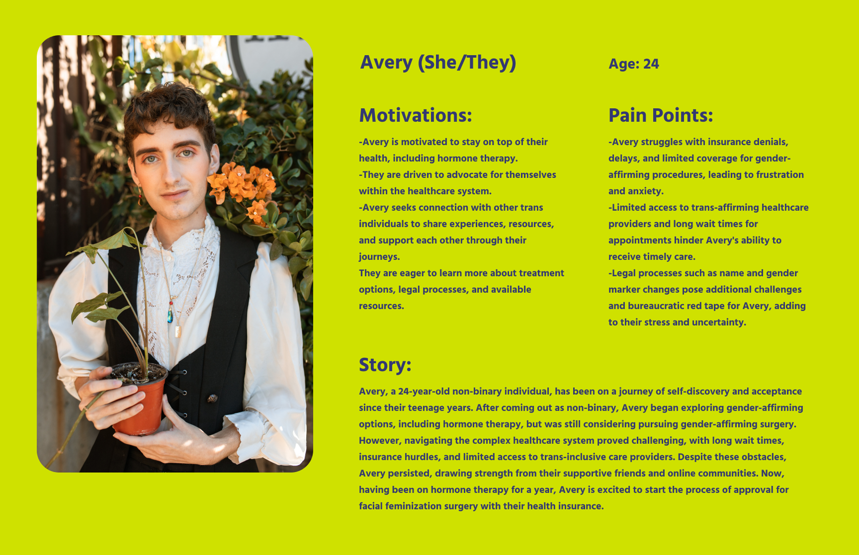
Creating User Personas Helped to Make Decisions with Empathy:
By delving into various user backgrounds, needs, and pain points, I gained valuable insights to tailor solutions effectively and cater to the unique experiences of the app’s users.
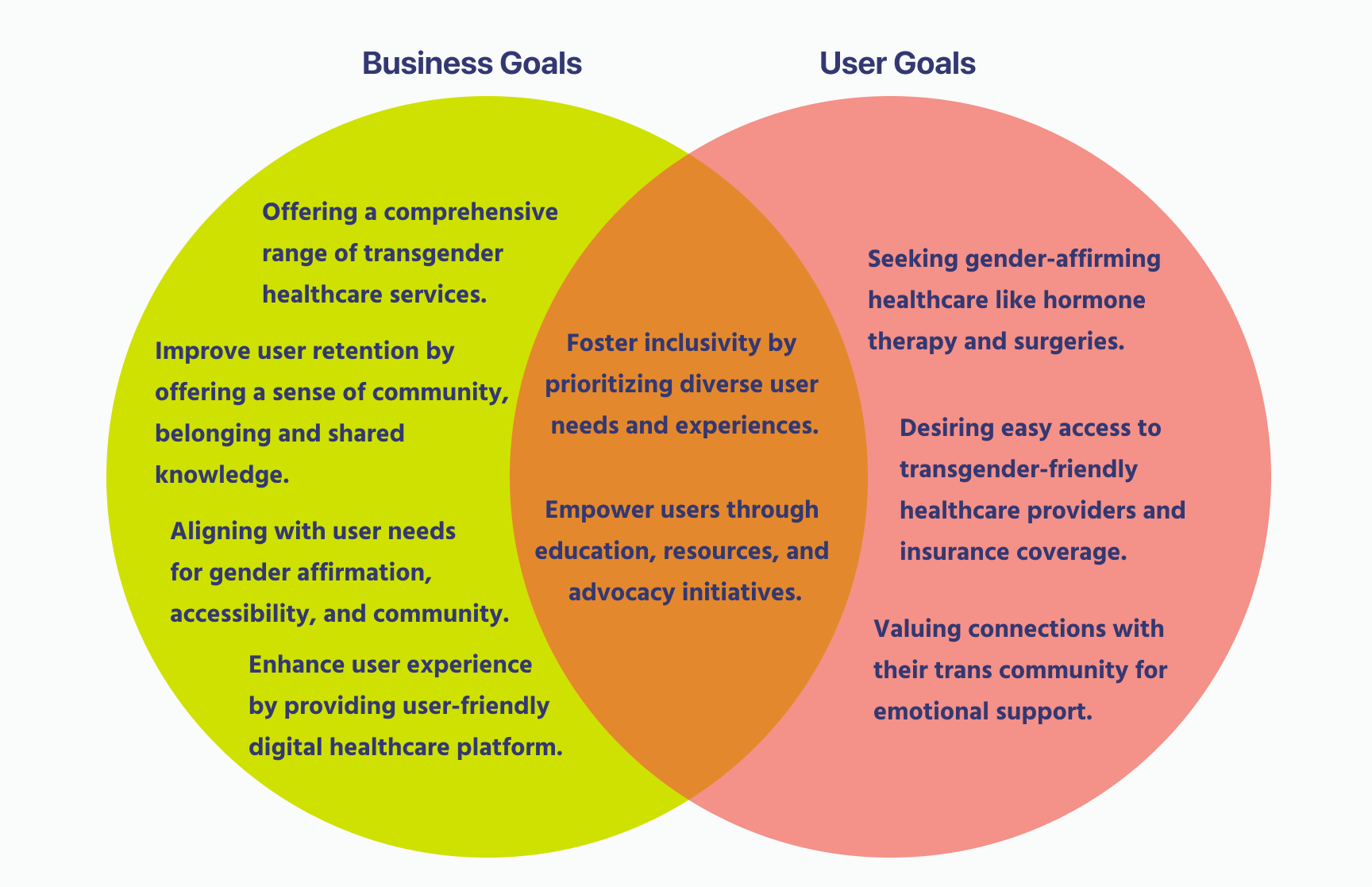
Project Goals and Prioritization:
The convergence of business and user goals ensures mutual success and satisfaction. This guiding principle persisted during the design phase, driving my commitment to delivering comprehensive transgender healthcare solutions prioritizing gender affirmation, accessibility, and community support.
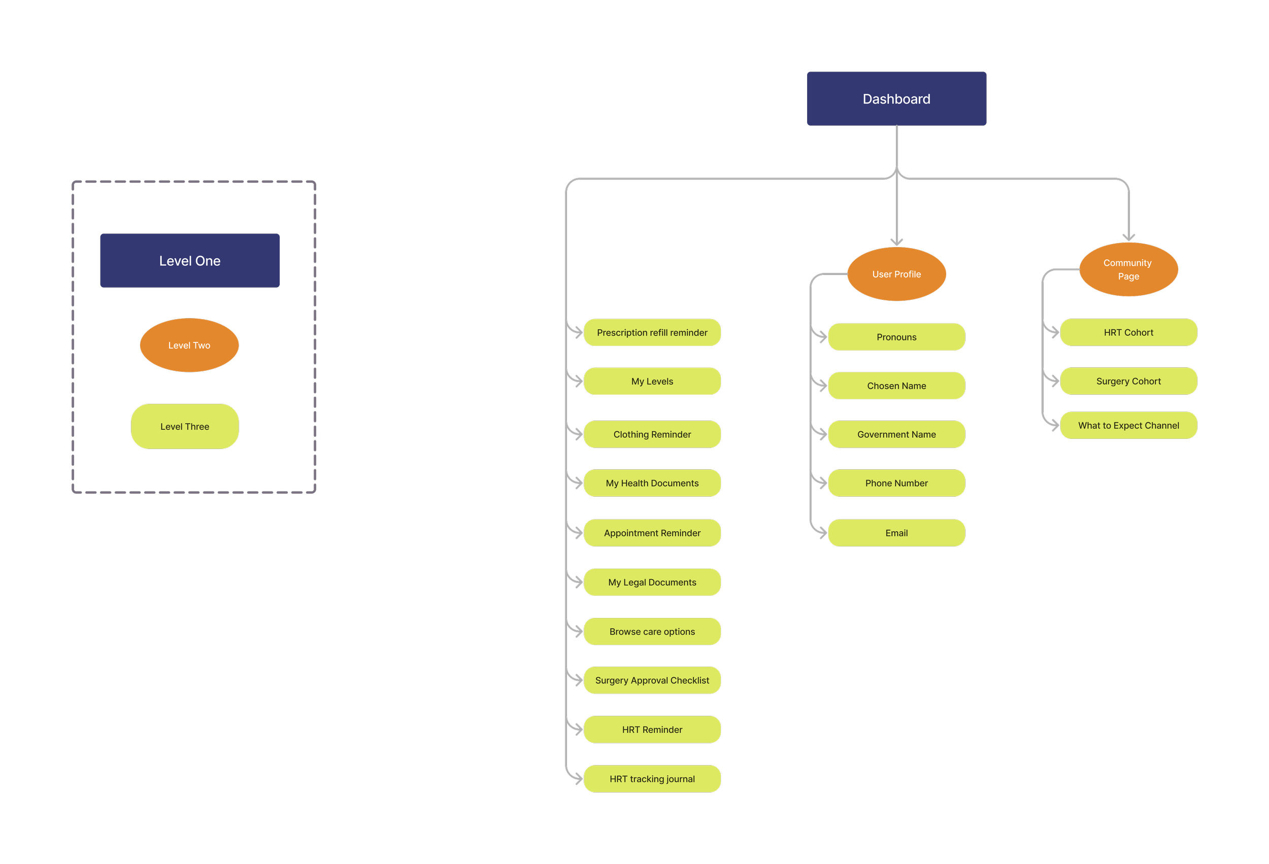
Site-Mapping:
I opted for a minimalist information architecture to ensure users' seamless navigation through the app without feeling overwhelmed or lost. This approach prioritized accessibility and streamlined access to essential information, promoting a user-friendly experience and fostering engagement with key features without the need for a scavenger hunt.
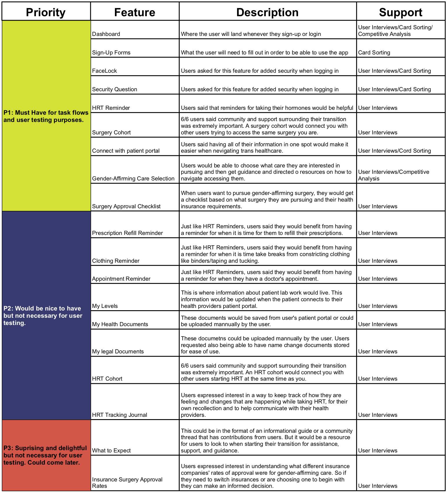
Figuring out which features of the design to prioritize:
During the design phase, I meticulously prioritized features based on task flows critical for user testing. This approach ensured that the app's functionality aligned closely with user needs and allowed me to focus on refining key interactions and functionalities to enhance user experience and meet project objectives effectively.
User Flow: Signing up for a New Account
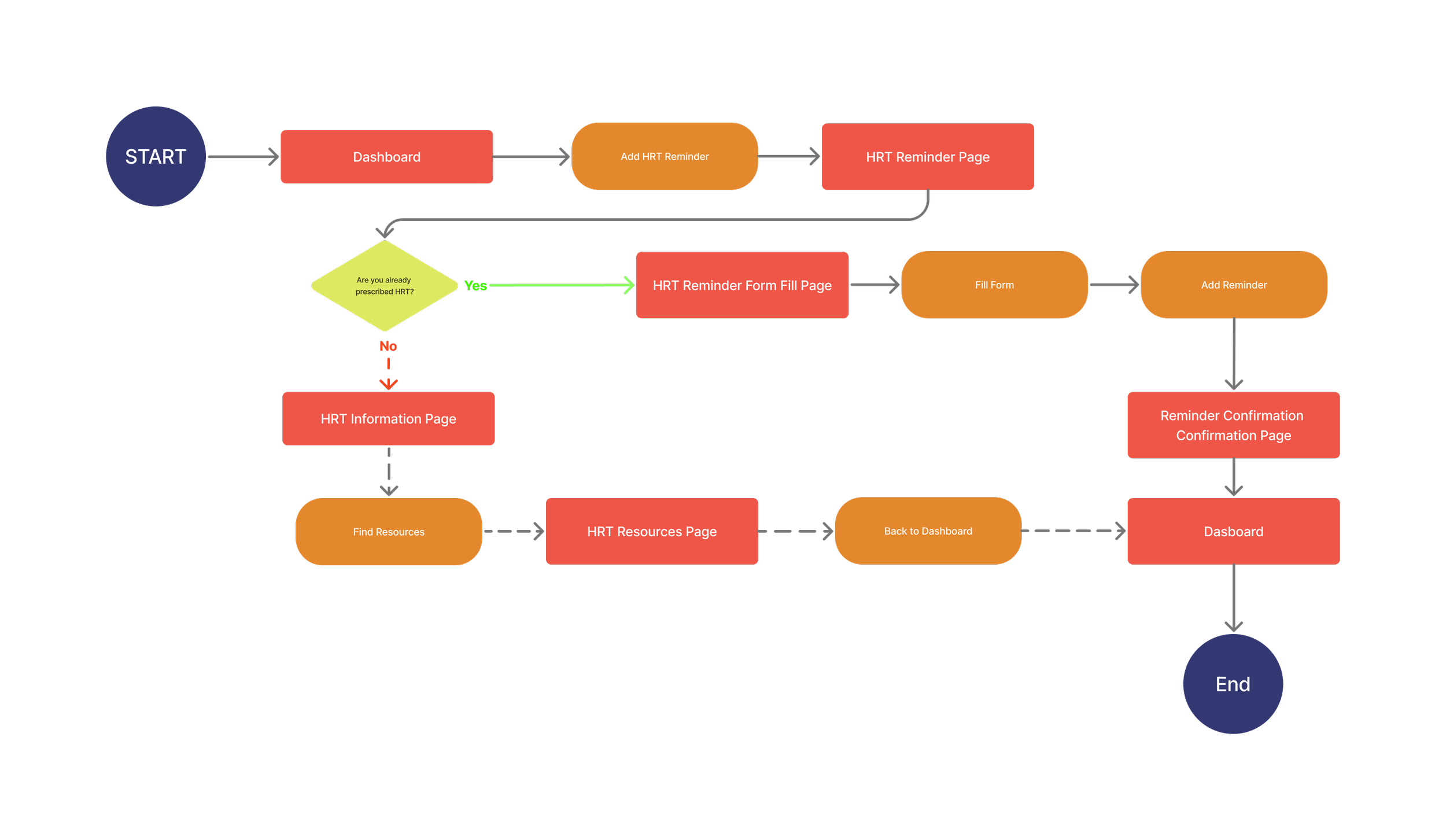
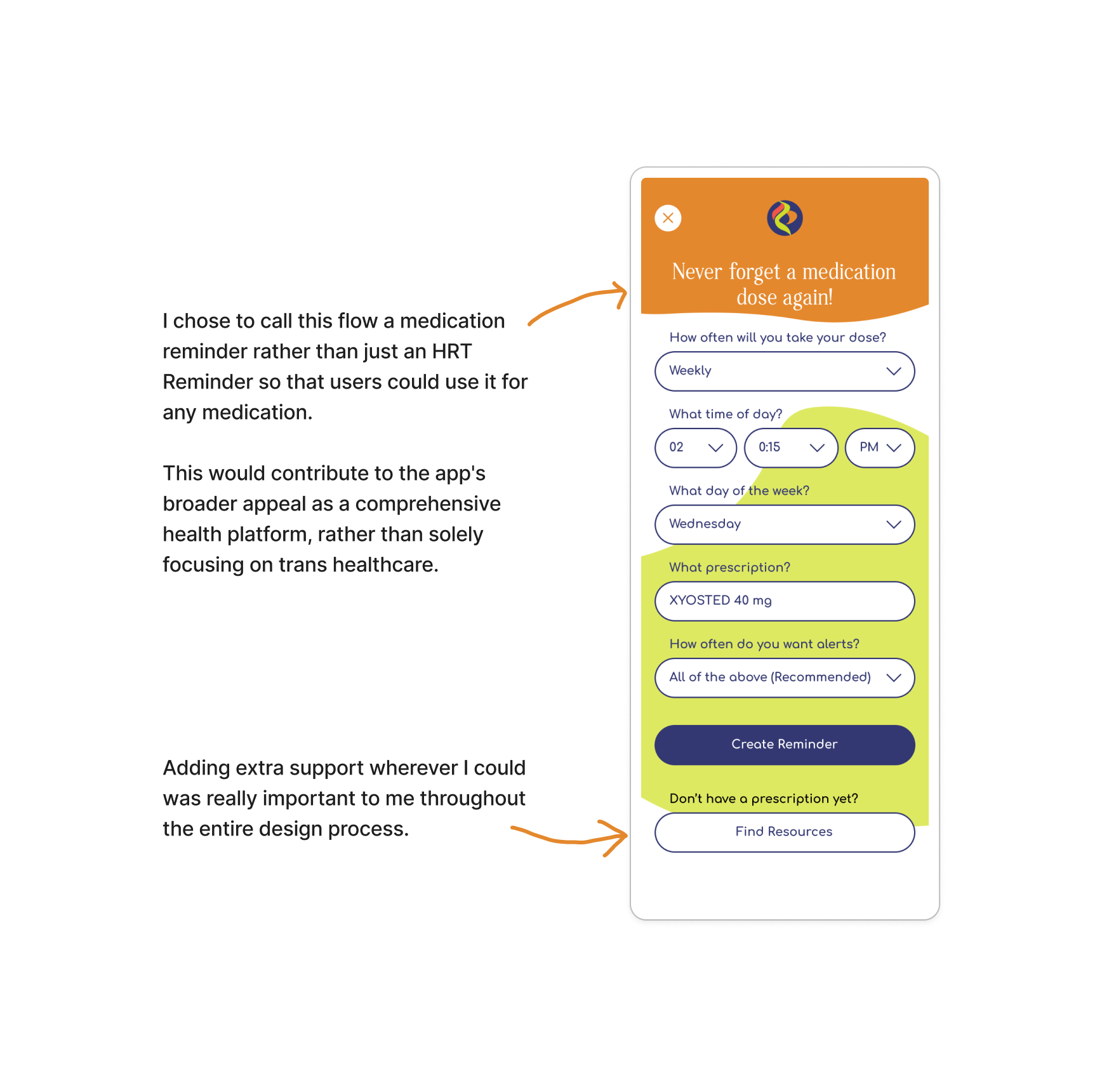
User Flow: Set an HRT Reminder
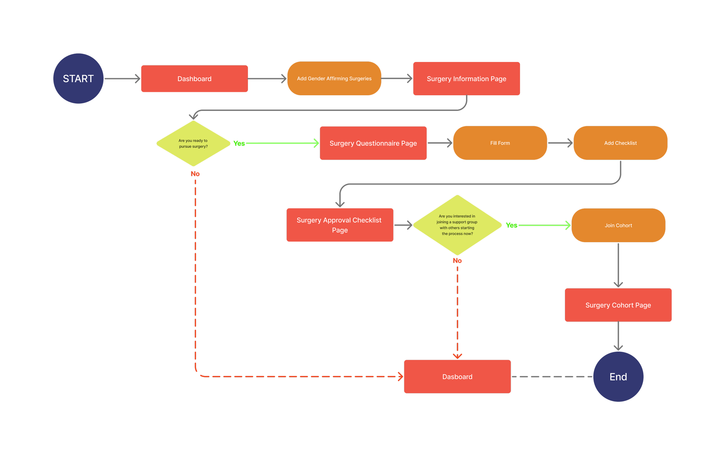
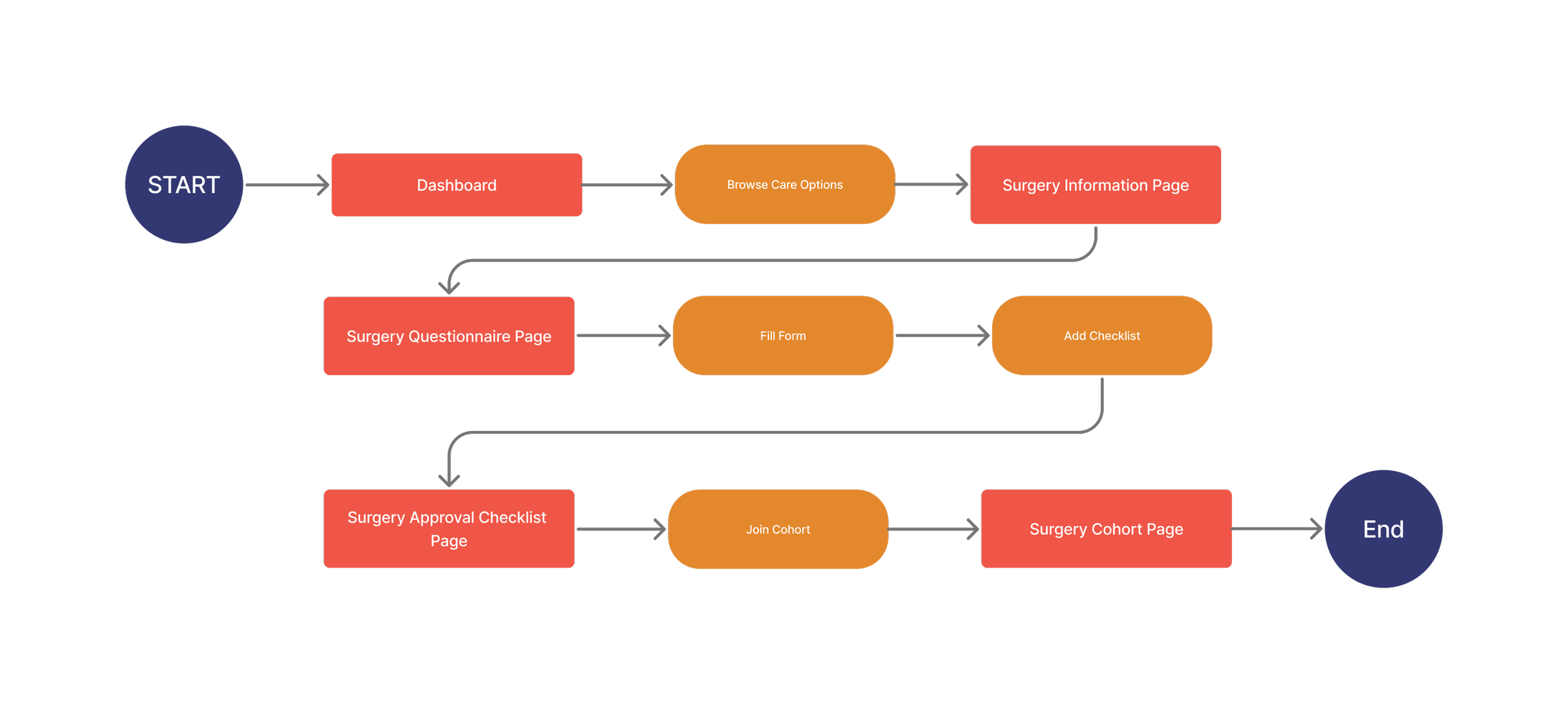
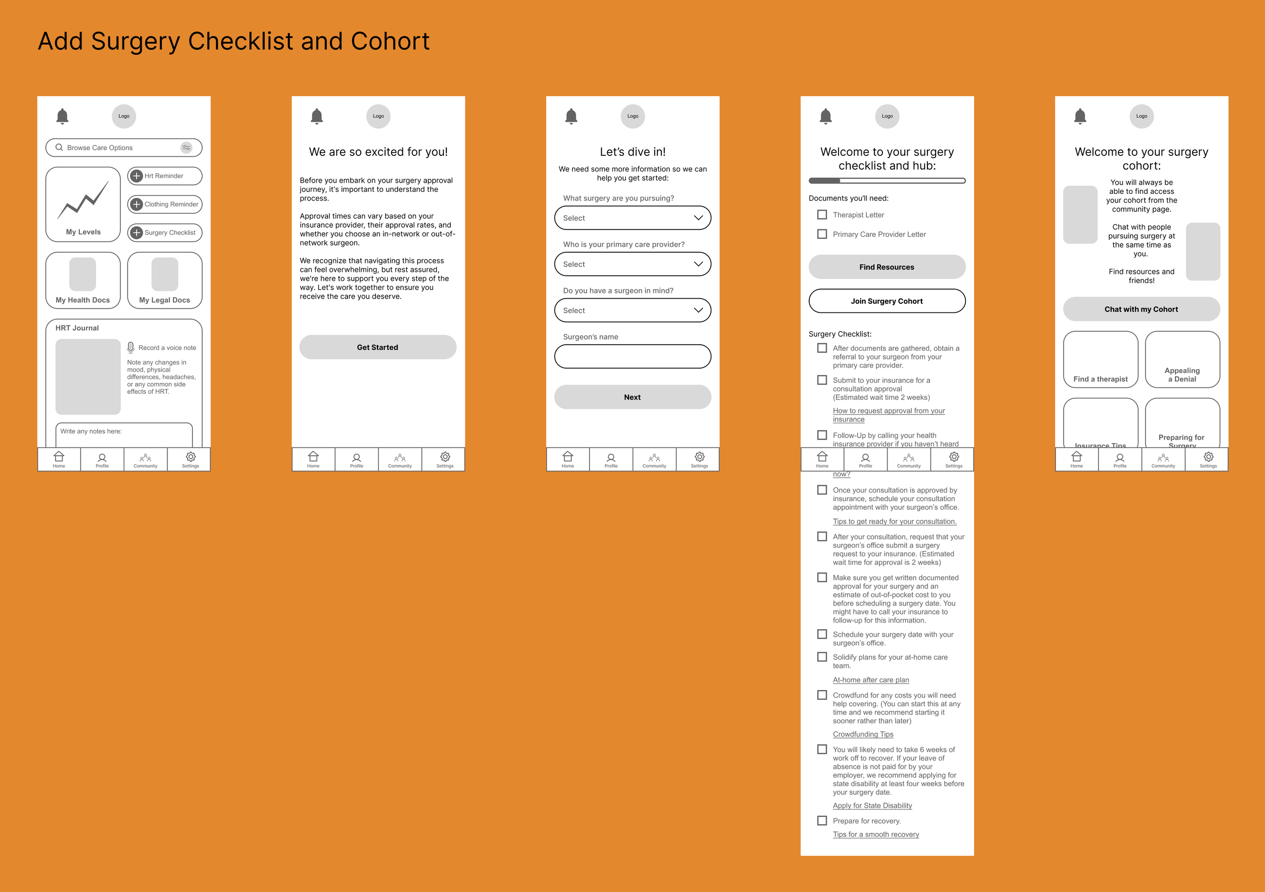
User Flow: Add a Surgery Checklist
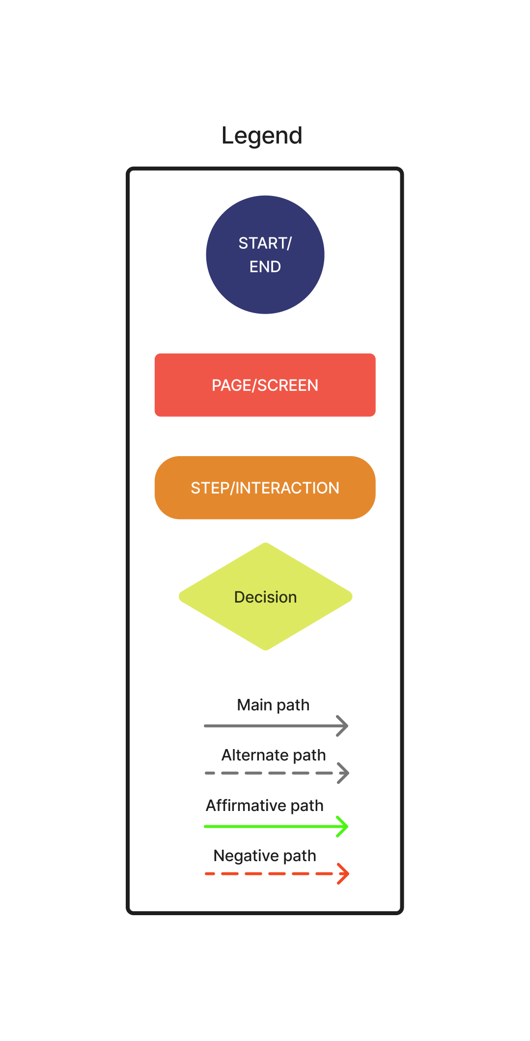
Developing user flows was instrumental in understanding the intricate interactions within the information architecture of the trans healthcare app, mapping out various pathways users could navigate to reach their intended destinations. Special attention was given to user flows for signing up, adding medication reminders, and adding a surgery checklist as they represent pivotal actions requiring high user engagement and frequent interaction, ensuring a seamless and intuitive user experience throughout the platform.
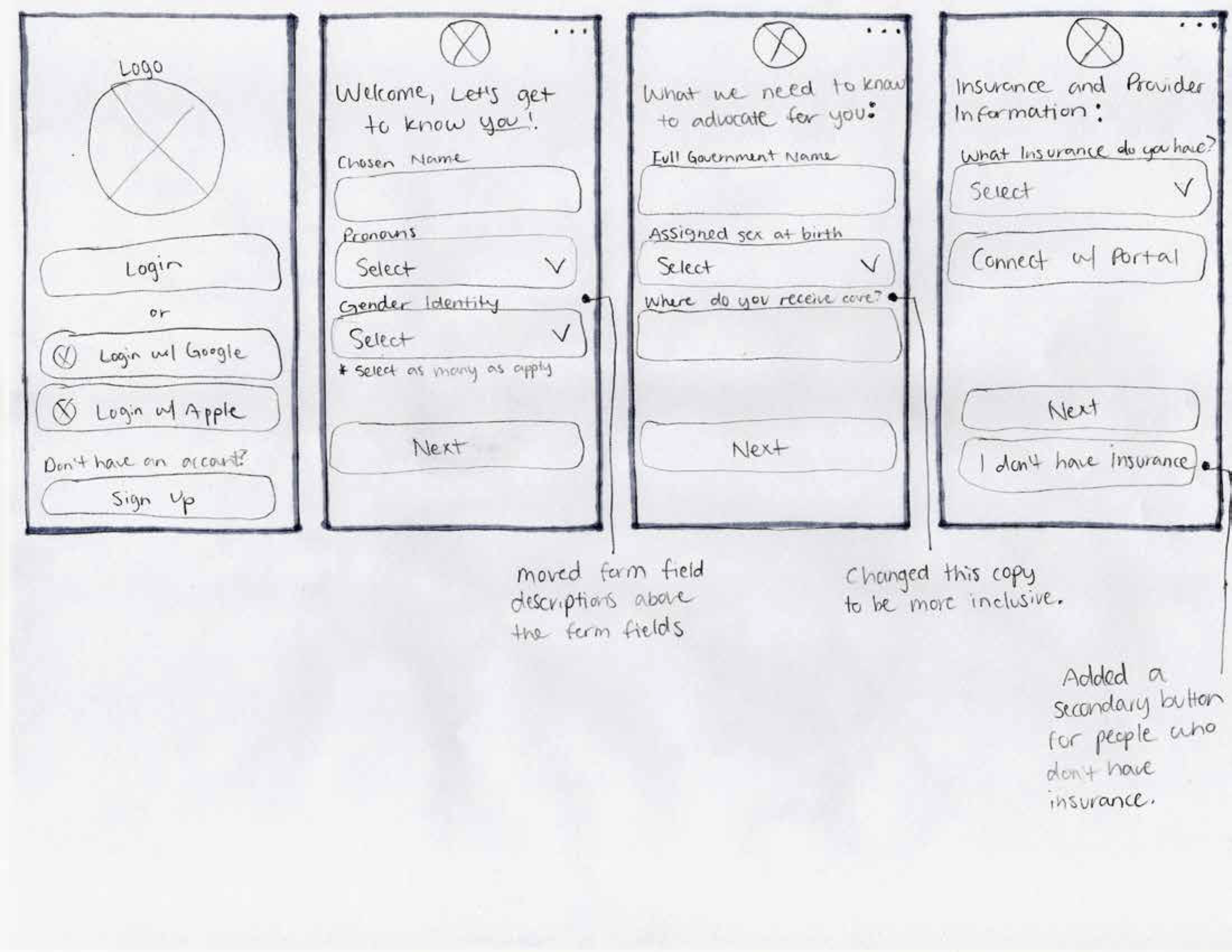
Task Flow: Signing up for a New Account
Task Flow: Adding an HRT Reminder
Task Flow: Adding a Surgery Checklist
After creating the user flows, I created task flows that depict the optimal path potential users would take. These task flows were used to test the product during the user testing phase.
Starting the Design Process
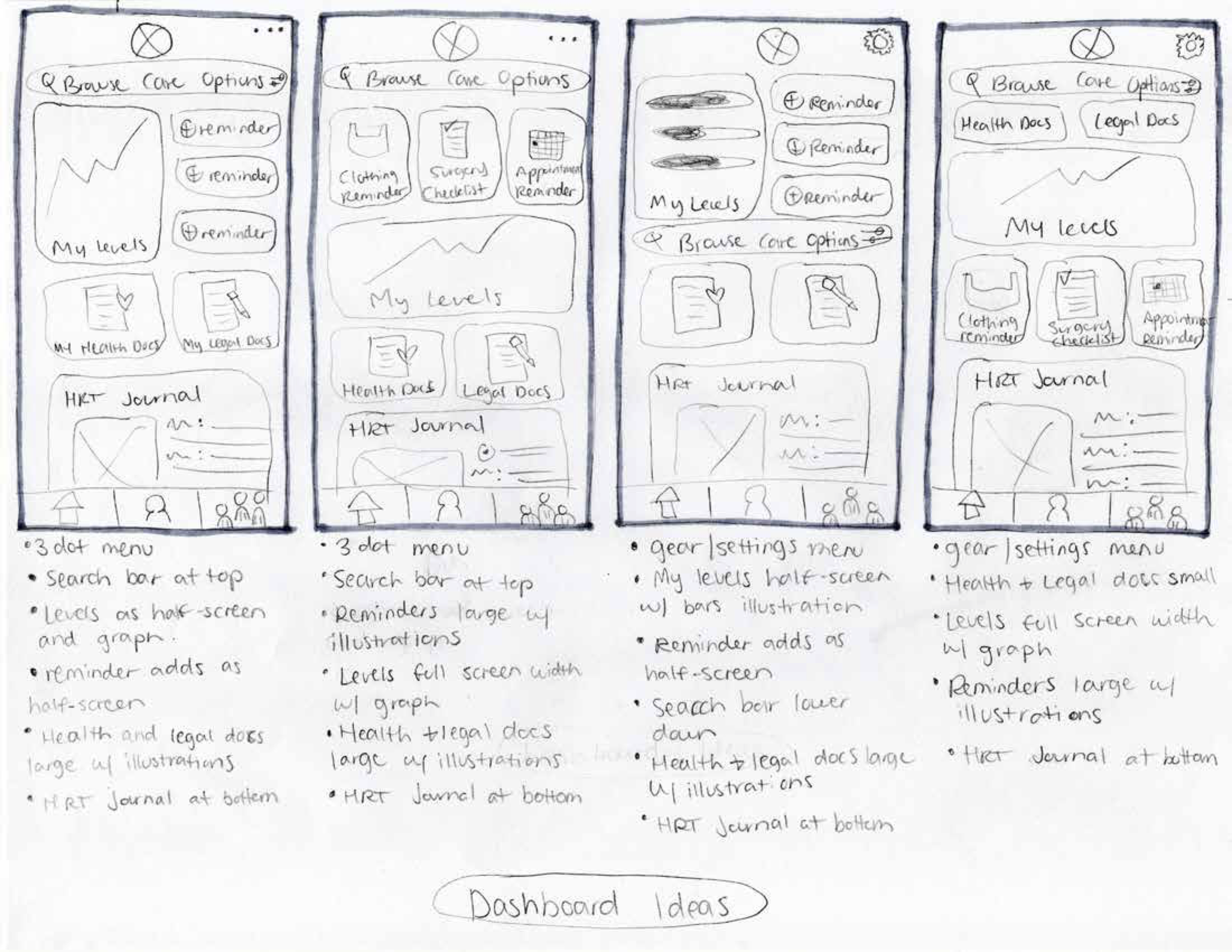
Sketching the Main Screens:
Sketching out ideas for the main screens of app helped me identify the most important features to focus on. This allowed me to visualize how my initial thoughts would appear in the app before creating detailed designs. Subsequently, when I drafted rough wireframes, I was able to strategically plan the layout of each screen and identify any potential user flow issues.
Mid-Fidelity Wireframes:
While developing my mid-fidelity prototypes for the trans healthcare app, I converted my initial low-fidelity sketches into digital designs. Along the way, I identified the need for additional screens to fully cover the task flows essential for user testing in the high-fidelity prototype.
Branding
Themes
Bright
Playful
Accessible
Medical
Inviting
In designing the app, I drew inspiration from the vibrant colors, and playful nature that is inherent to the queer and trans community.
The bright and lively color palette aims to evoke feelings of positivity and optimism, fostering a welcoming environment for users.
Additionally, the minimalistic logo design and UI elements with high legibility were chosen to ensure ease of navigation and accessibility for all users. Soft corners were incorporated to impart a sense of gentleness and comfort, enhancing the overall user experience.
After exploring numerous name options, I settled on "Cocoon." It encapsulates the transitional phase of waiting, evoking feelings of warmth and comfort that I aim for users to experience while engaging with the app.
Components and Variants:
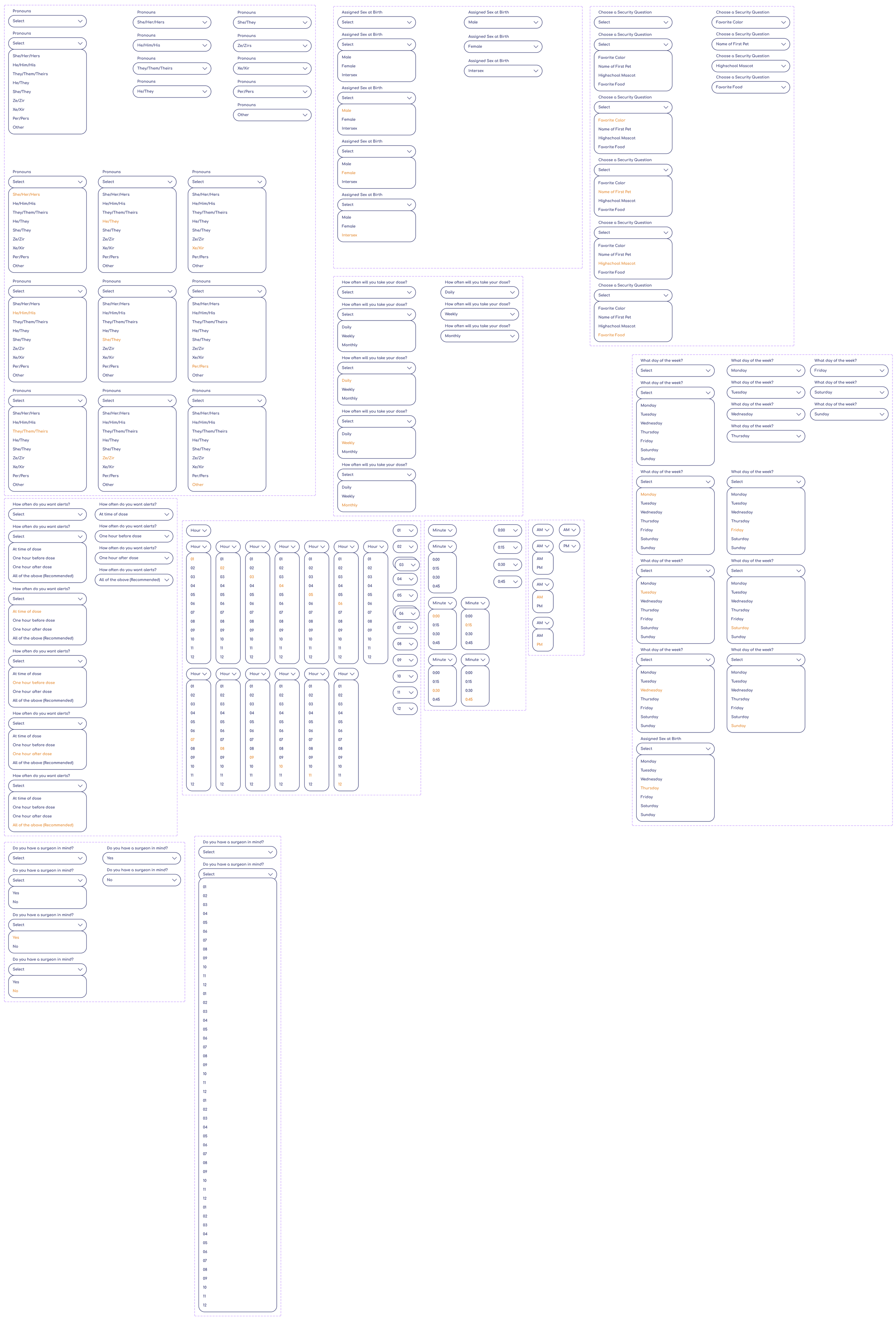
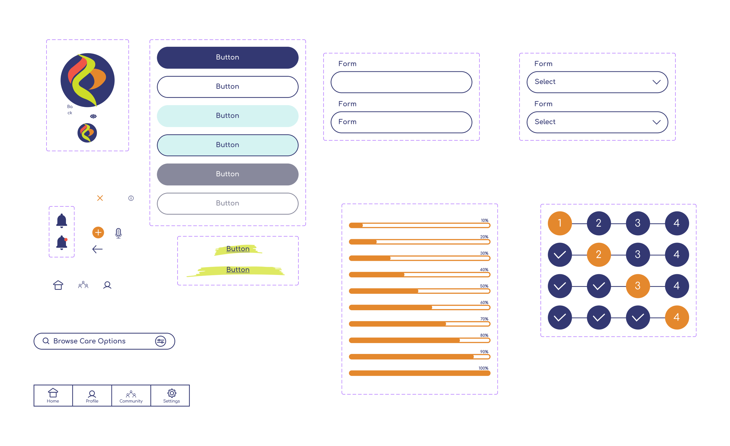
Creating a component and variant library was crucial to maintaining organization and consistency throughout the design process. By establishing a centralized repository, I ensured that the prototype remained cohesive and efficient.
This approach allowed me to make the prototype as interactive as possible, mirroring the functionality of the actual app during user testing. This not only provided a realistic user experience, but facilitated more accurate feedback and insights for further refinement.
High-Fidelity Wireframes
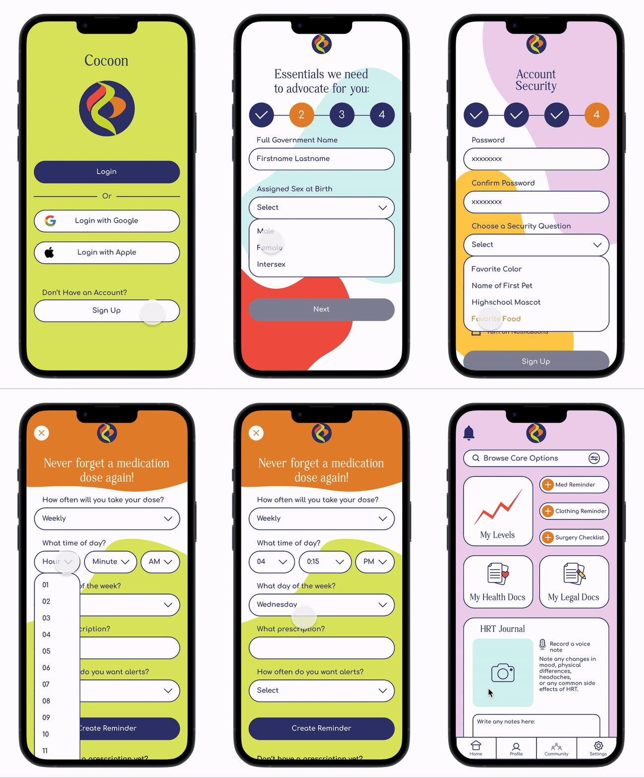
Signing up for a New Account:
Adding an HRT Reminder:
Adding an Surgery Checklist:
Putting Cocoon to the Test
Usability Testing and Priority Revisions:
Methodologies: The usability test will be moderated and will be held virtually in Google Hangout. The test will take about 20 minutes to complete.
Goal: User testing is vital for validating our design decisions and ensuring the app meets its goals. Gathering feedback from our target audience allows us to assess usability, identify areas for improvement, and enhance the overall user experience.
Objectives:
Observe how potential users will interact with the interface.
Observe how easily they will be able to accomplish task flows.
Guage the qualitative experience of Cocoon.
The Prototype Used for Testing:
Users were asked to complete these three tasks during user testing:
Completing Sign-Up
Adding an HRT Reminder
Adding a surgery checklist
Looking at the User Testing Results:
Users were able to complete the assigned tasks through Cocoon
On a scale of 1 to 5 (1 being extremely easy and 5 being extremely difficult), All users rated each task a 1.
Users were able to move through the task flows quickly.
Users report positive feedback about the overall design
Aside from minor constructive feedback, users expressed an overall enthusiasm for the app. All users said they would recommend Cocoon to a friend or loved one.
How I Prioritized Revisions:
Using a priority matrix, I assessed suggested revisions based on importance and difficulty. This guided the implementation plan for the next iteration.
Explore the priority matrix and suggested revisions below.
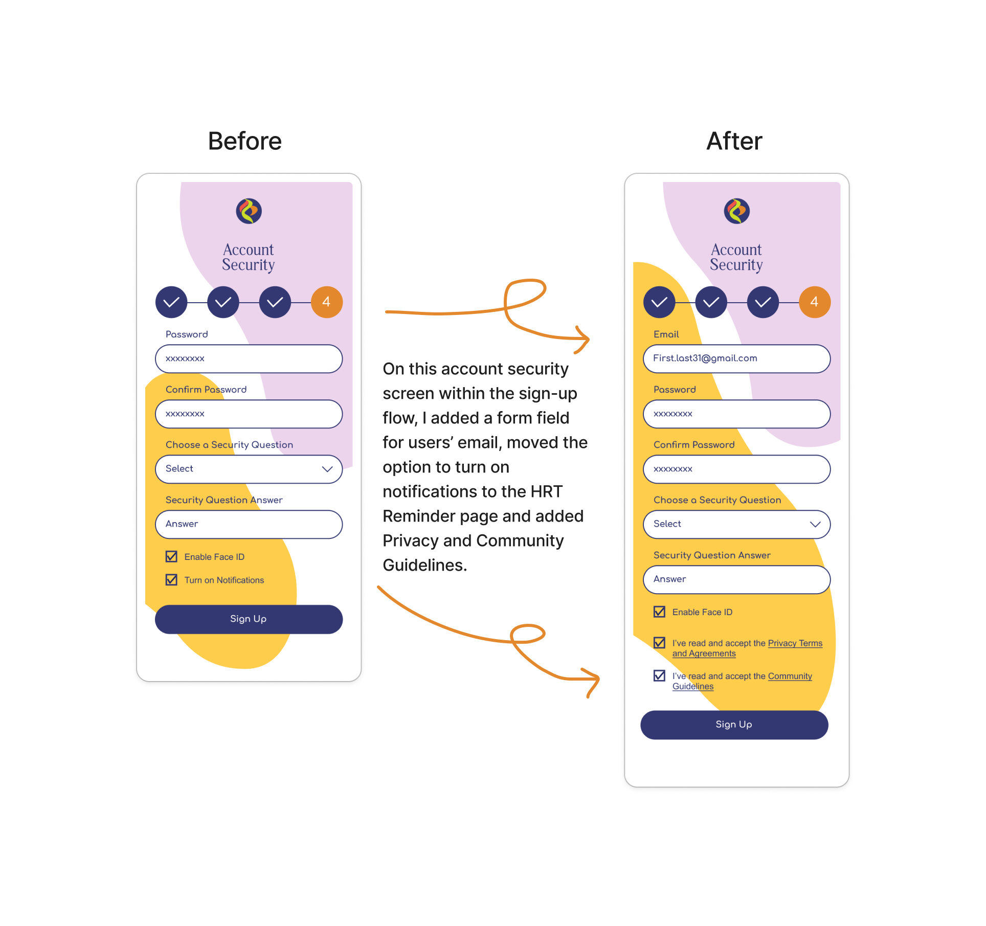
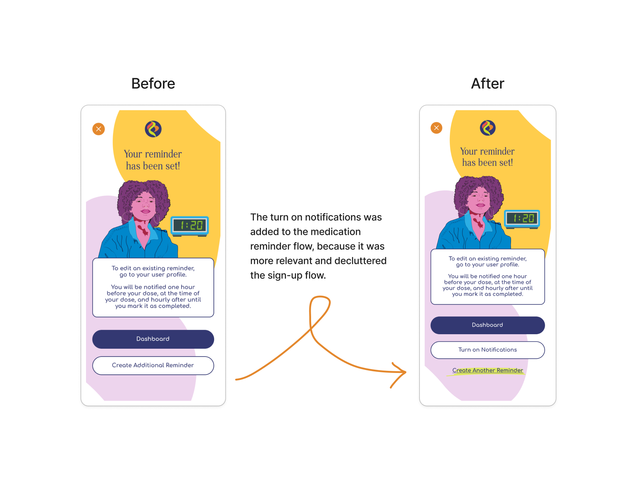
A Closer Look at the Iterations:
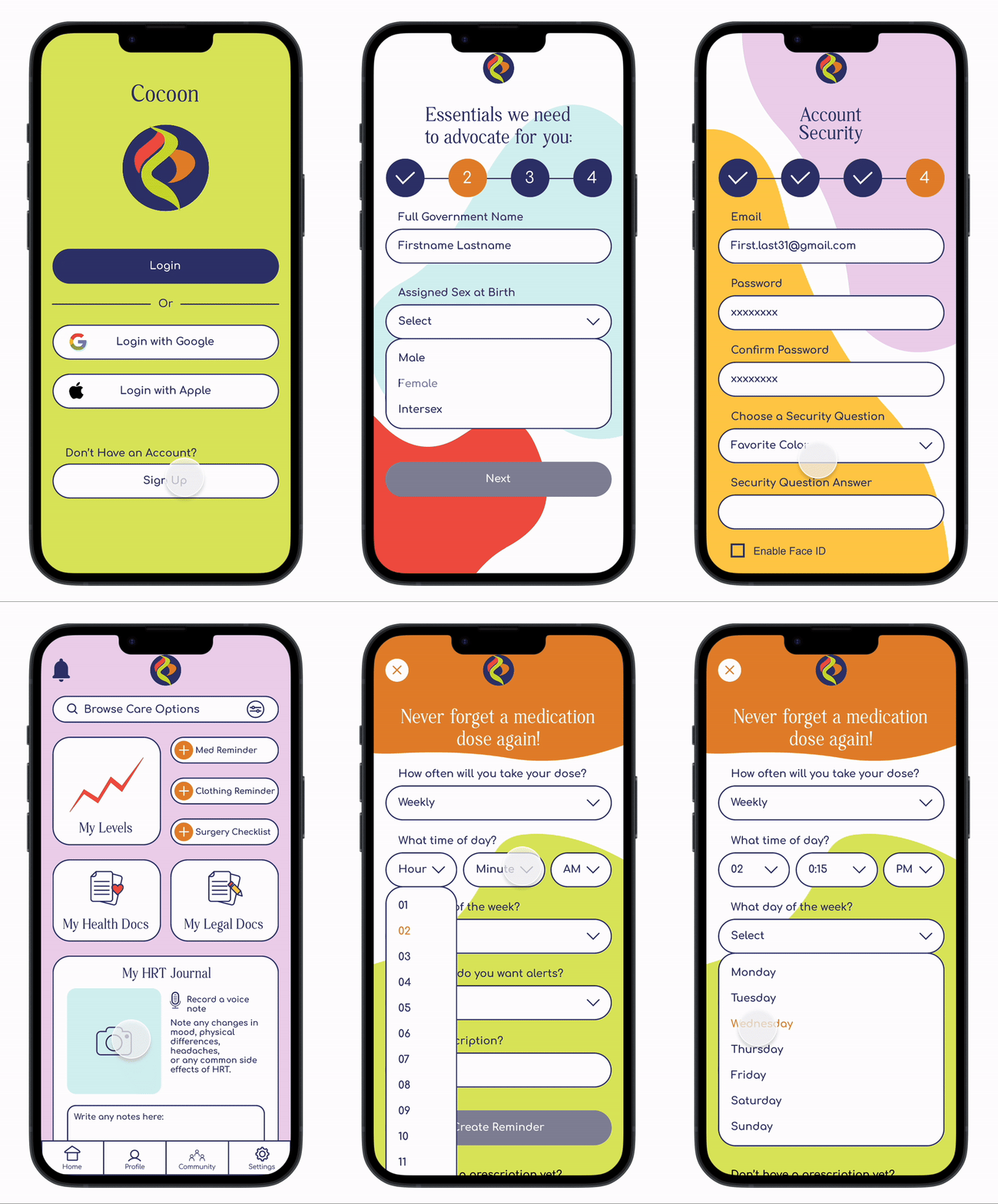
The Final Prototype:
What I Learned
Throughout this project, I gained invaluable insights into the nuances of designing for transgender healthcare. I learned the importance of empathizing with users' experiences and ensuring accessibility and inclusivity in every design decision. This journey reinforced my belief in the transformative power of user-centered design, inspiring me to continue creating meaningful solutions that positively impact people's lives.
Moving Forward:
As I move forward, my plan is to expand the scope of the project by designing additional screens and flows to further enhance the user experience. I also aim to incorporate dedicated pages for the linked resources, providing users with comprehensive support and information.


