US Immigration Made Simple:
Tackling US immigration to streamline the application process for Visas, Green Cards, DACA, and Citizenship.
Nearly 70,000 foreigners arrive in the United States every day. While there are many different avenues immigrants can take to get here, many methods can be confusing, time-consuming, and generally lacking accessibility. Some of the main gaps in accessibility are language, time, and finances. By creating a product that helps bridge these gaps, I hope to alleviate some of the stress for people going through the process.
Why Tackle Immigration:
I was motivated to undertake this project because of the stories I heard from my friends who had been through the process. Their experiences made me realize that the immigration application process can be frustrating, financially inaccessible, and even demeaning and scary at times.
Unfortunately, this has always been the case, and it is only exacerbated by the growing stigma faced by immigrants in the United States, especially in today's tumultuous political climate.
I wanted to develop a tool that could offer people much-needed direction, resources, and most importantly, the dignity they deserve as they navigate this challenging process.
Getting to Know the Users
User Interviews:
I completed one-on-one interviews with participants.
I asked them questions about their process of going through the US immigration system.
Through the interviews, I discovered the participant's motivations and pain points.
Participants:
Participants ranged from 30-42
5/6 participants learned English as their second language
5/6 participants went through multiple visa applications on their journey to citizenship
4/6 participants have a desire to become a full citizen. One participant already obtained their citizenship.
What I asked:
Open-ended questions about the participant's qualitative experiences of going through the immigration process, mostly about their thoughts and feelings.
How they kept themselves organized throughout the process.
About their motivations for wanting to move to the United States.
About any pain points they faced during the process.
Affinity Mapping:
What I learned:
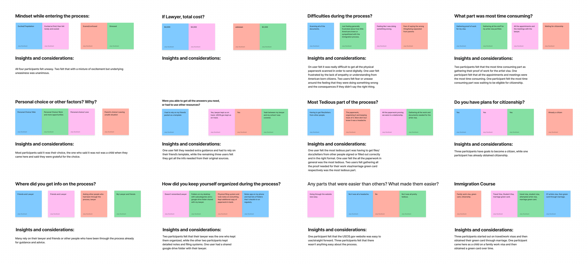
All participants felt uneasy about starting the immigration process. Two felt that with a mixture of excitement but underlying uneasiness was unanimous.
5/6 participants hired a lawyer to help them get through the process.
5/6 participants had multiple different types of visas before obtaining their Green Card. One is a DACA recipient.
4/6 participants said it was their choice to come to the United States. 2/6 were children when they came here so it was their parent's decision.
Two participants felt that their lawyer was the one who kept them organized, while the other two participants kept detailed notes and filing systems. One user had a shared Google Drive folder with their lawyer.
Affinity mapping helped to organize the data from user interviews into actionable insights.
Competitive Analysis:
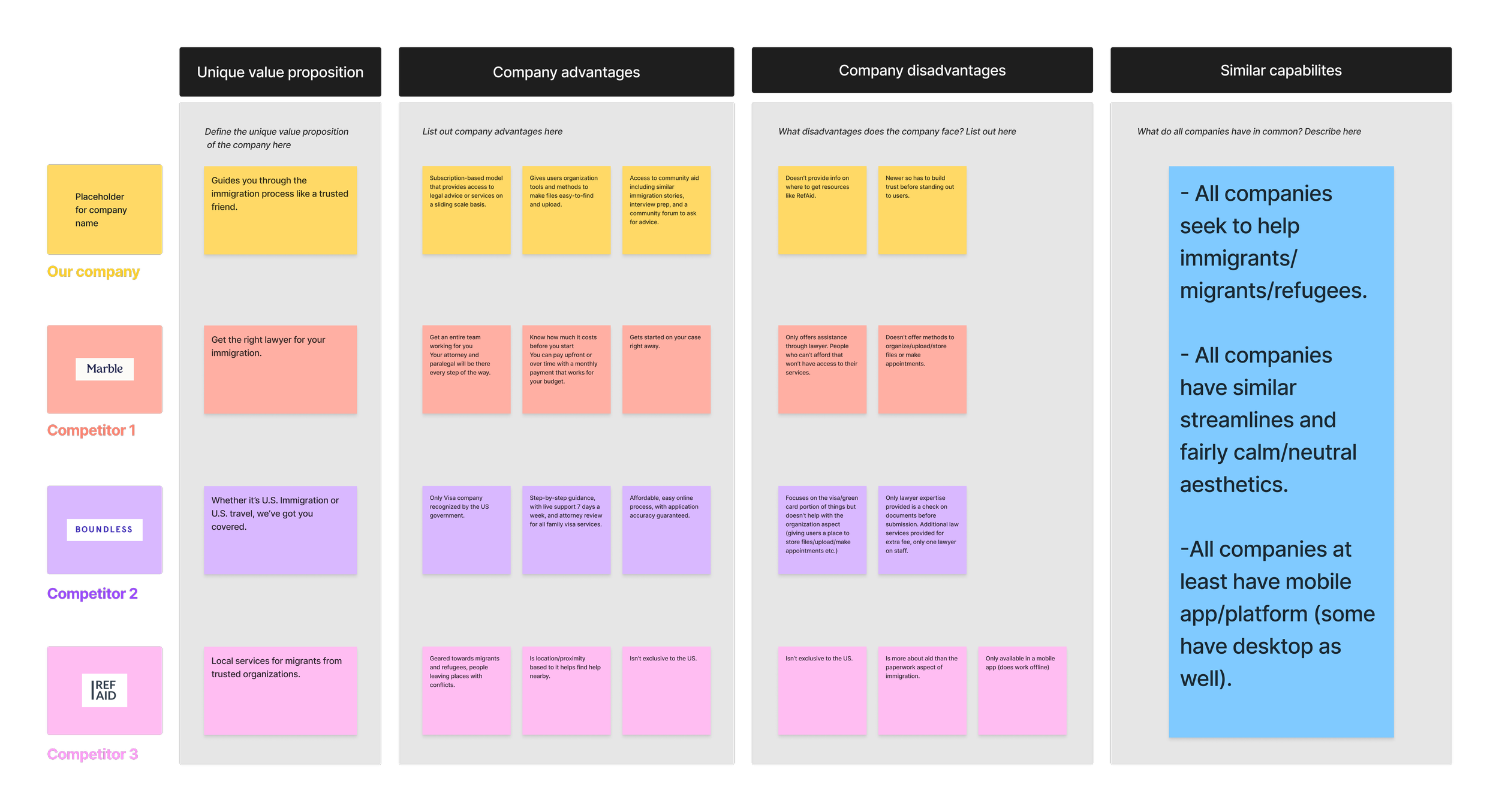
Primarily helps with guiding you through the visa application process.
Helps migrants find local services from trusted organizations.
Focuses on matching users with an immigration lawyer.
What I Learned:
All companies seek to help immigrants/migrants/refugees.
All companies have similar streamlined and calm/neutral aesthetics.
All companies at least have a mobile app/platform (some have desktop versions as well).
Researching the main competitors helped me understand what problems were currently being solved on the market, and which problems still needed to be solved.
Finding Direction for the Project
From the research I came up with the following POV and HMW statements:
POV
I’d like to explore ways of streamlining the paperwork process for immigrants to reduce the costs of immigration lawyers and reduce the stress surrounding completing the paperwork correctly.
HMW
How might we create a platform that allows immigrants to autonomously handle most of the process and still have access to a lawyer to check their work?
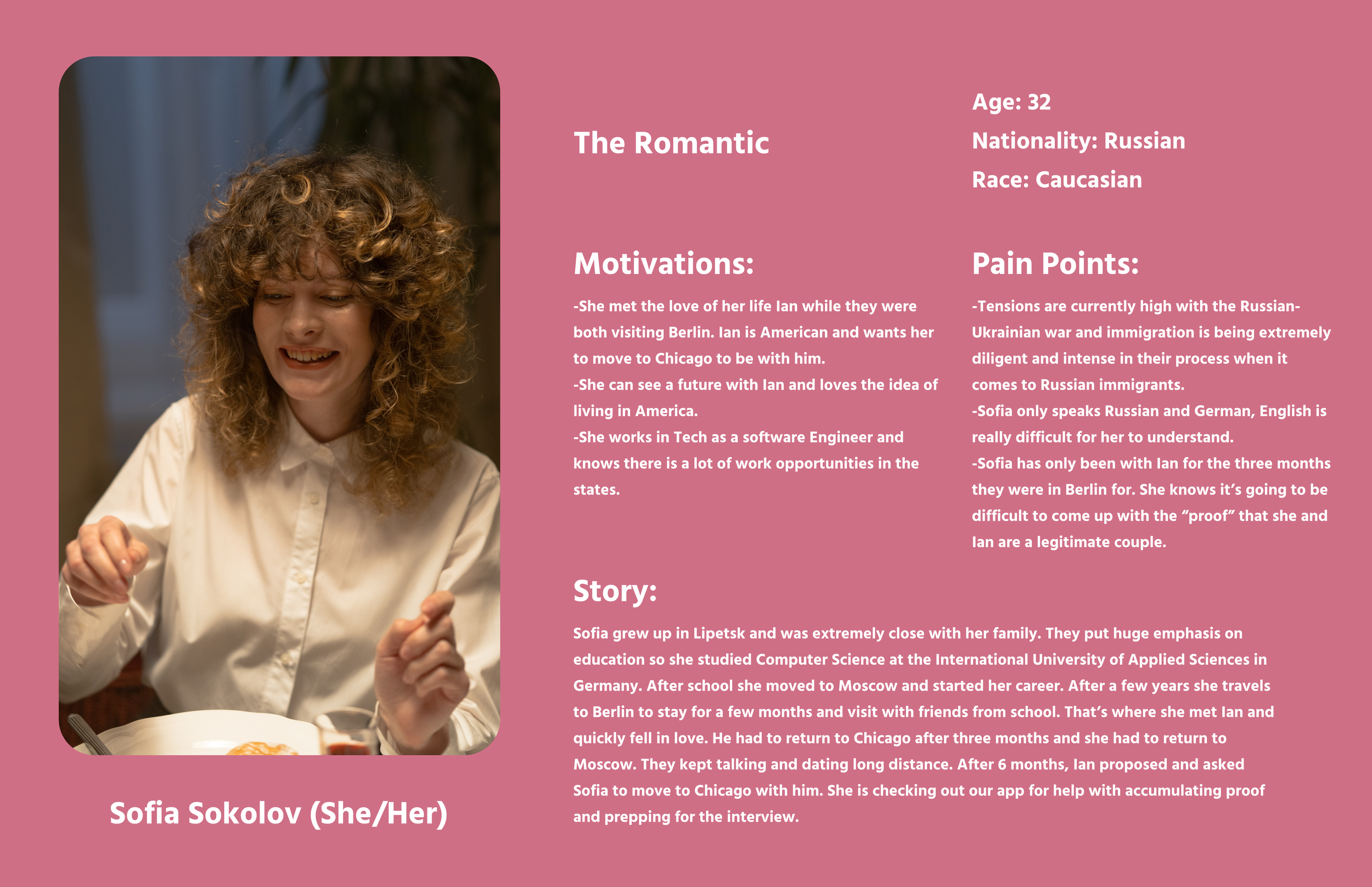
Creating User Personas Helped to Make Decisions with Empathy:
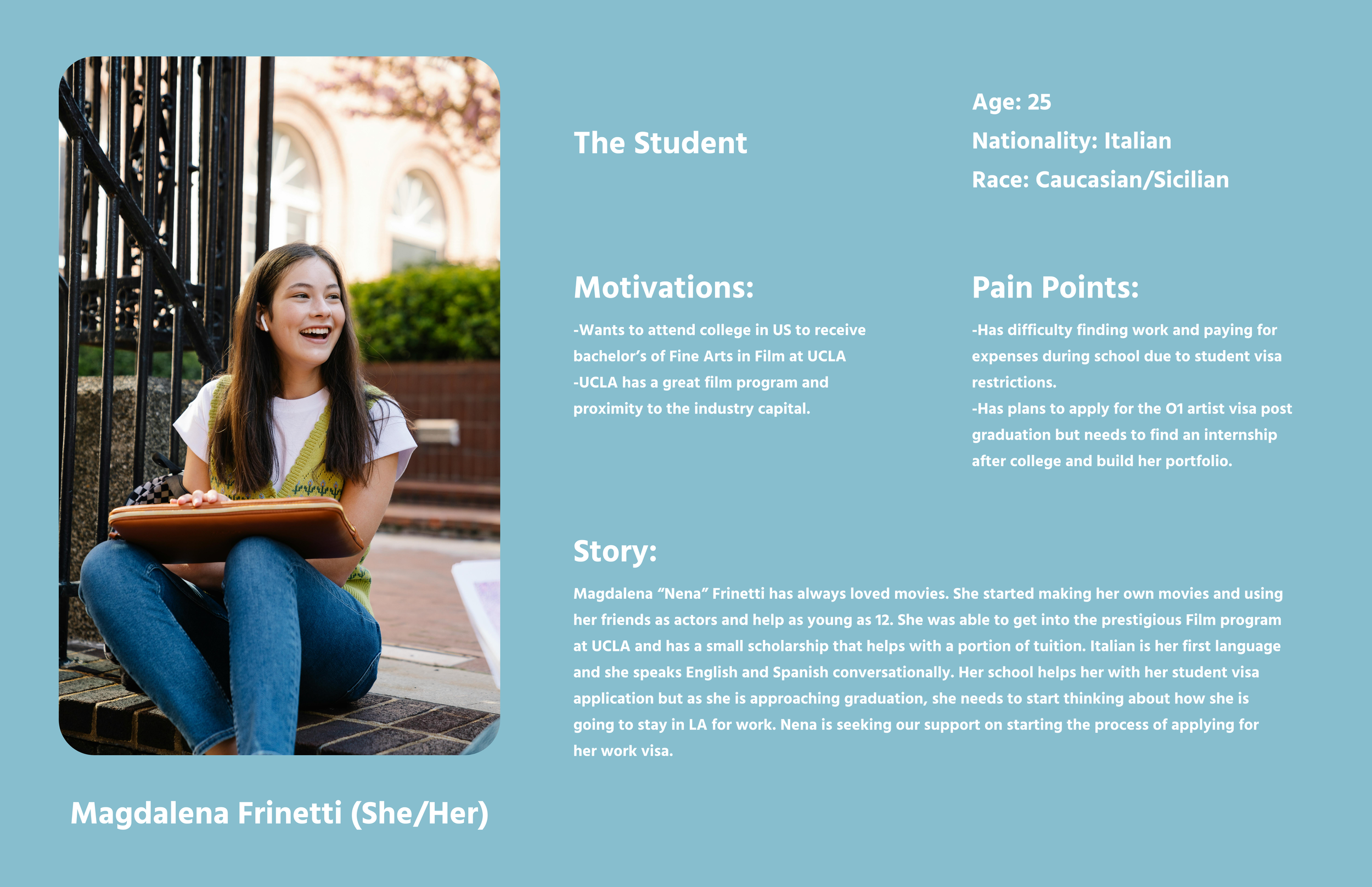
During the user research phase, I crafted user personas based on the poignant narratives and firsthand experiences shared during interviews. These personas served as the cornerstone of my design process, allowing me to empathize with the diverse spectrum of individuals navigating the US immigration system. By intimately understanding their unique needs, challenges, and aspirations, I could tailor the design of the platform to accommodate a wide range of users, ensuring accessibility and inclusivity at every stage of the immigration journey.
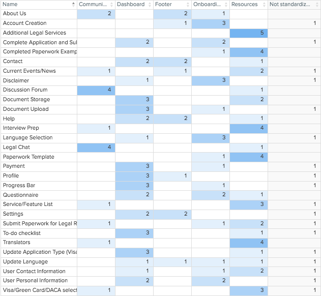
Card Sorting:
To ensure the navigation aligned with user expectations, I conducted a card-sorting activity. This provided valuable insights into organizing the mobile site, helping users quickly find tasks and information.
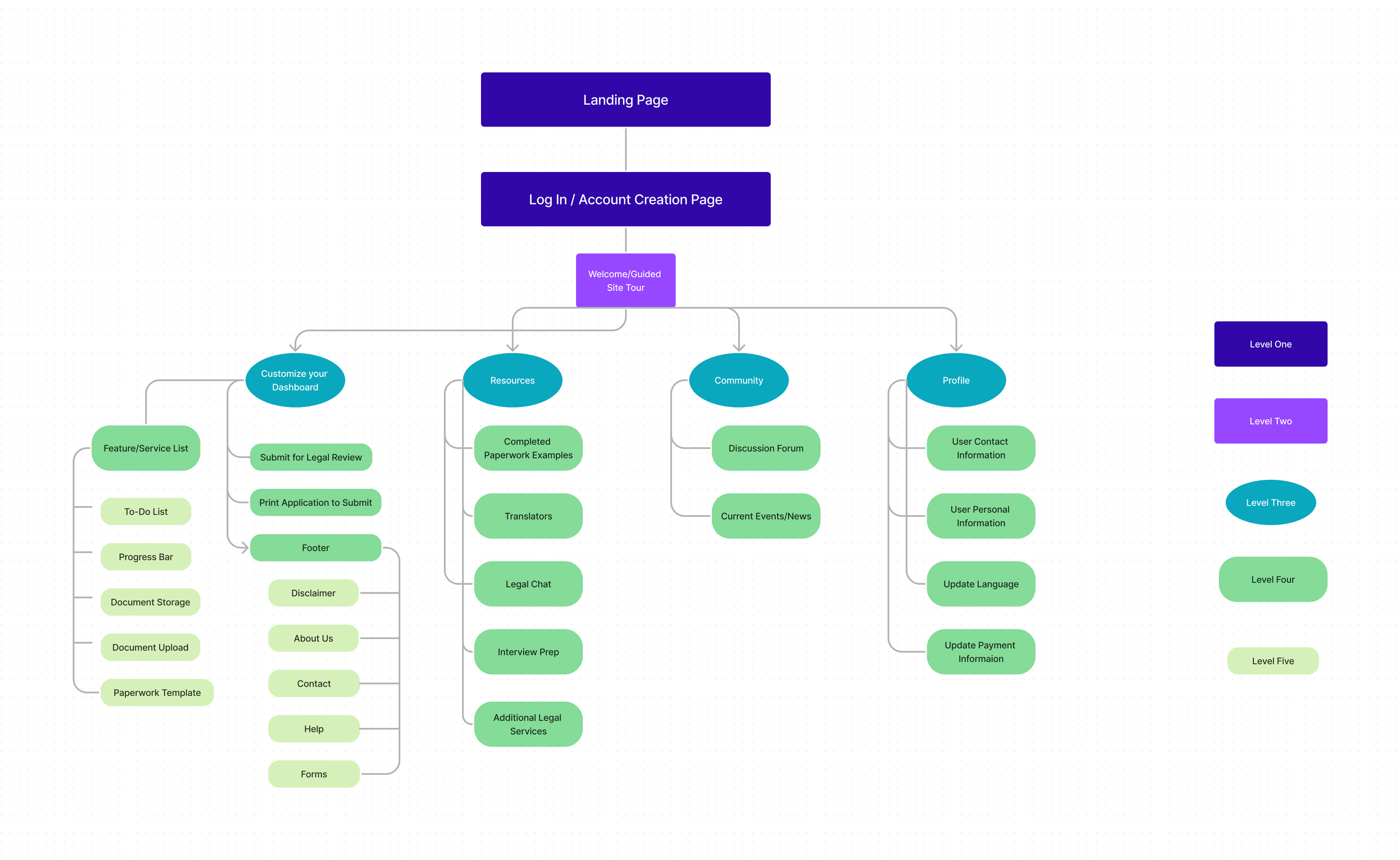
Site-Mapping:
Creating a site map was instrumental in visualizing the site's organization before delving into the sketching process. This strategic approach ensured that the number of pages users needed to navigate was minimized, reducing the likelihood of user errors and enhancing task completion efficiency. With a clear roadmap in place, I entered the design phase with heightened confidence and direction, enabling me to craft a more intuitive and user-friendly experience.
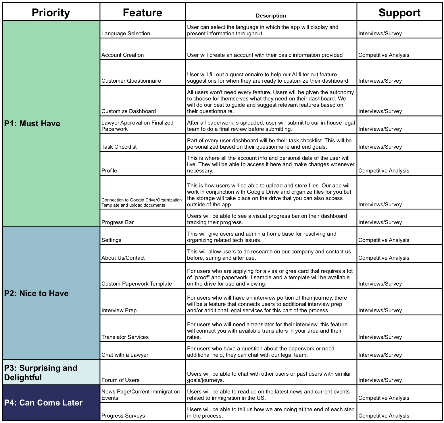
Prioritizing Design Decisions:
In order to make informed decisions about the prioritization of features, I analyzed the information gathered from user interviews and identified the main screens and features necessary to complete the most commonly used tasks on the site. Based on this analysis, I prioritized features certain features over others.
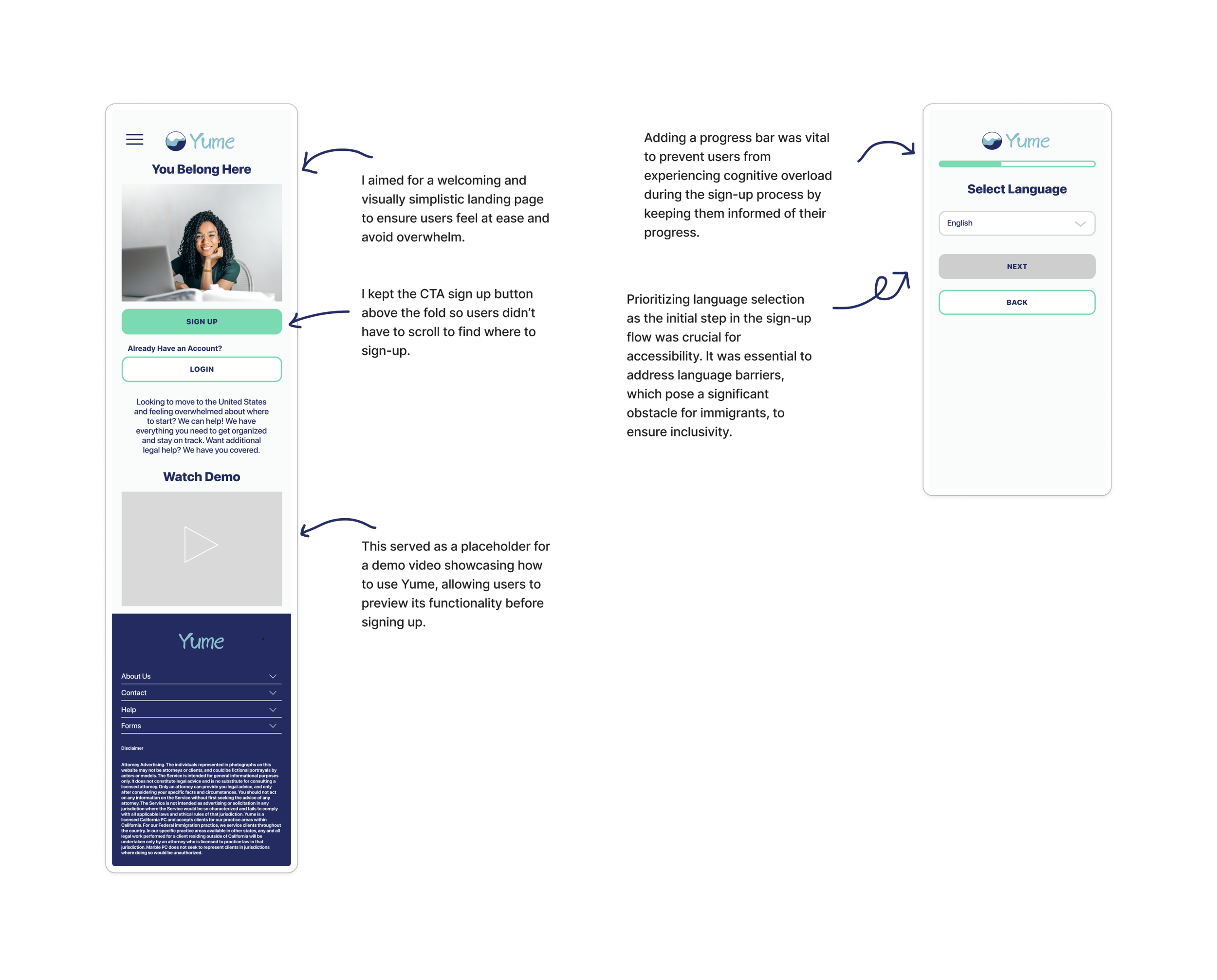
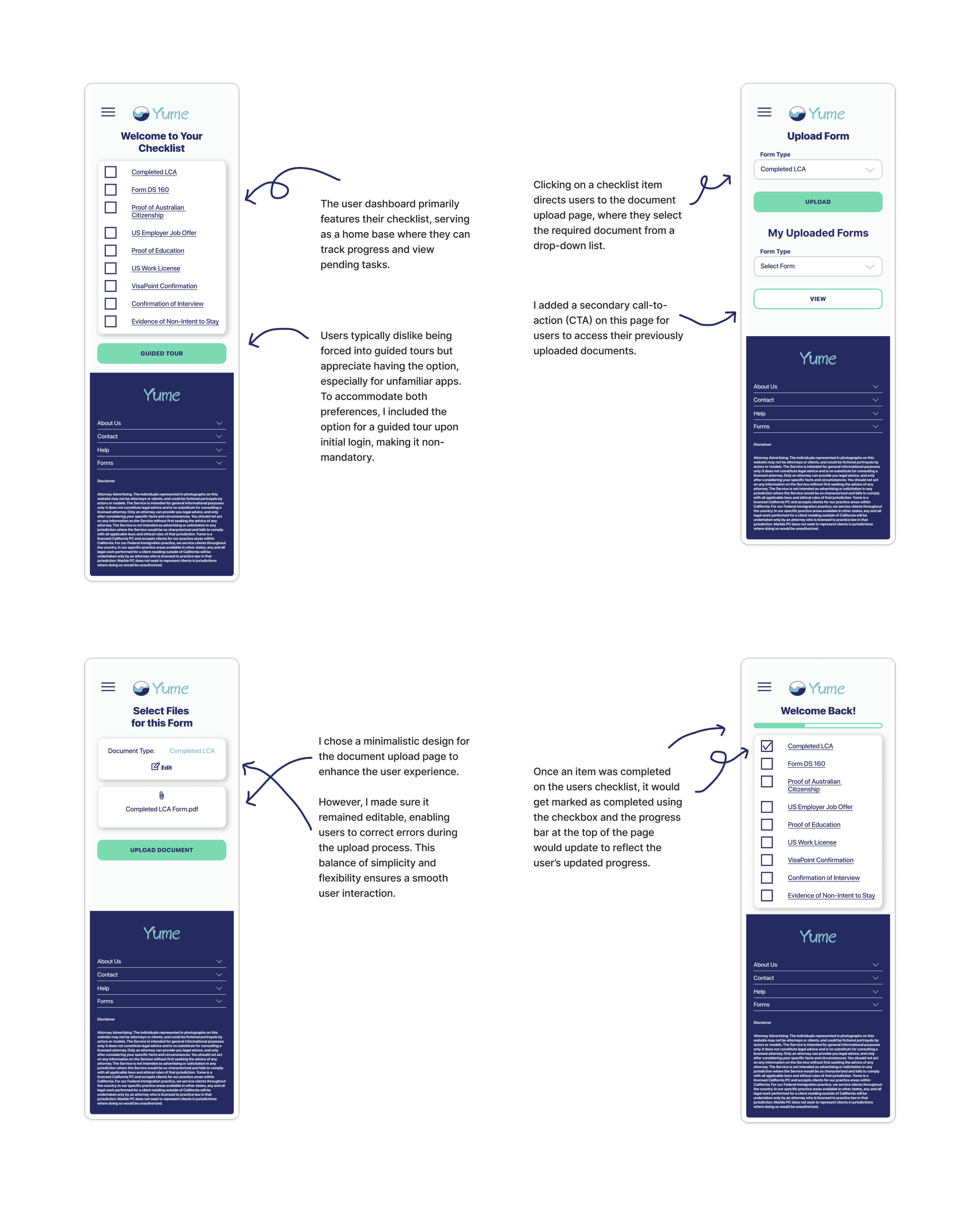
The features I felt were most important were the language selection for accessibility, task checklist for organization and for the main user-experience and the progress bar to keep the user informed on their progress throughout the process.
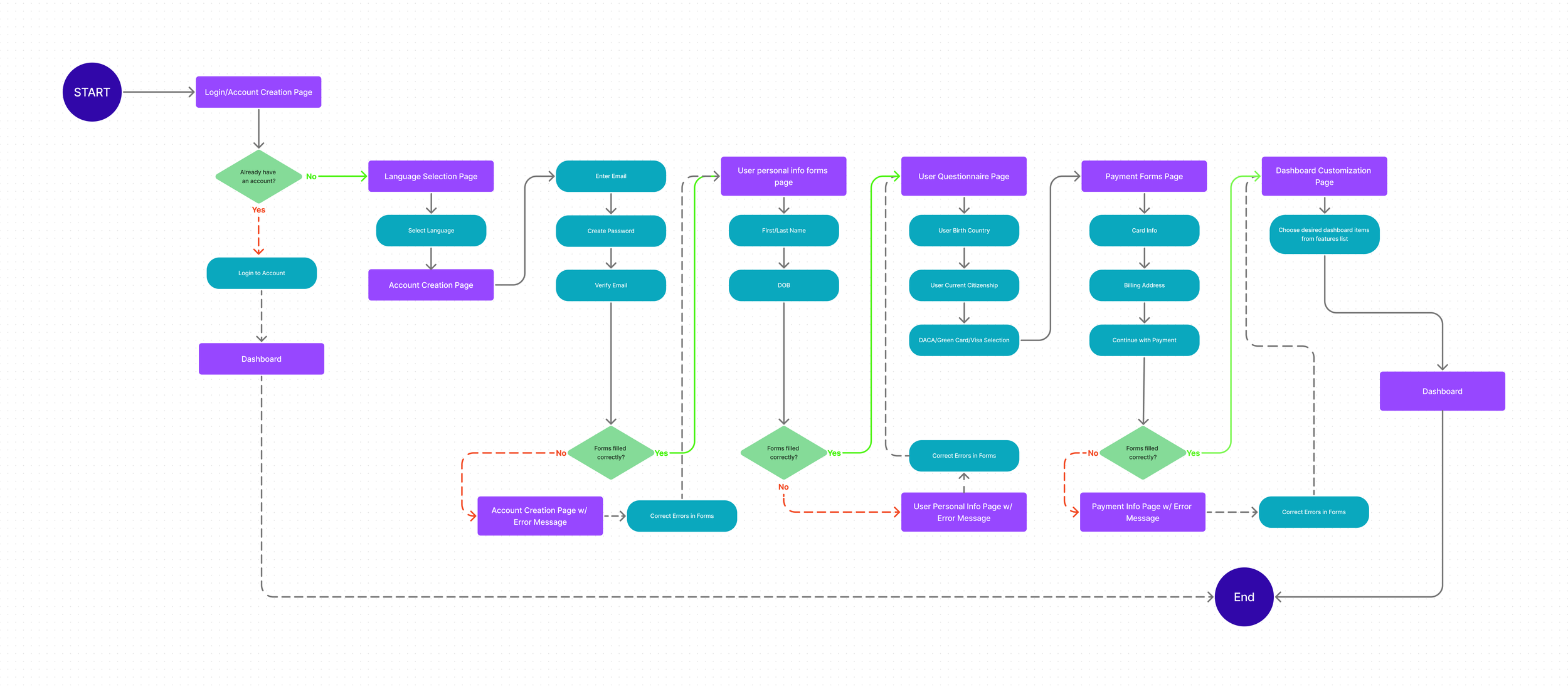
User Flow: Moving through the On-boarding Process
User Flow: Uploading a Document to the Site
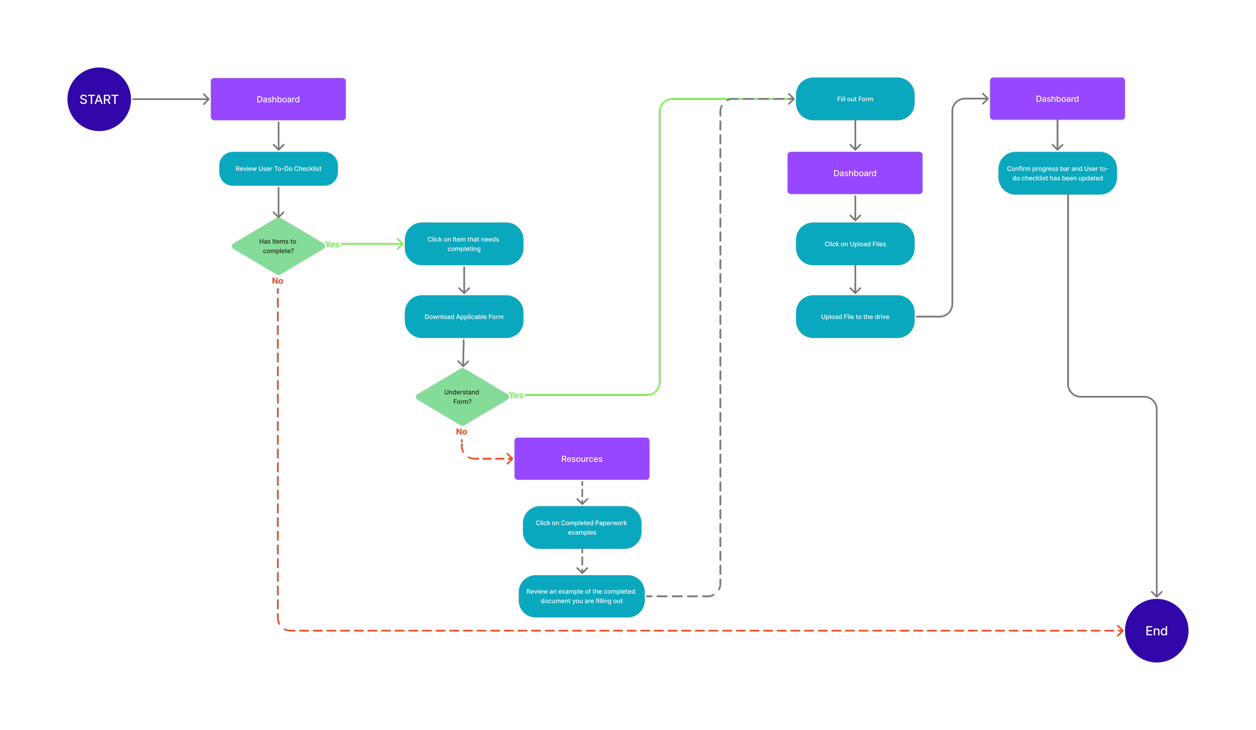
Creating the user flows helped to determine how users might interact with the information architecture, including all the possible paths users could take to get to the same destination. I explored the user flows of the on-boarding process and how a user would upload a document to the site because they are the actions that would require the most engagement from the users and be engaged with the most frequently.
Task Flow: Uploading Files
Task Flow: Application Submission
After creating the user flows, I created task flows that depict the optimal path potential users would take. These task flows were used to test the product during the user testing phase.
Starting the Design Process
Sketching out the Possibilities:
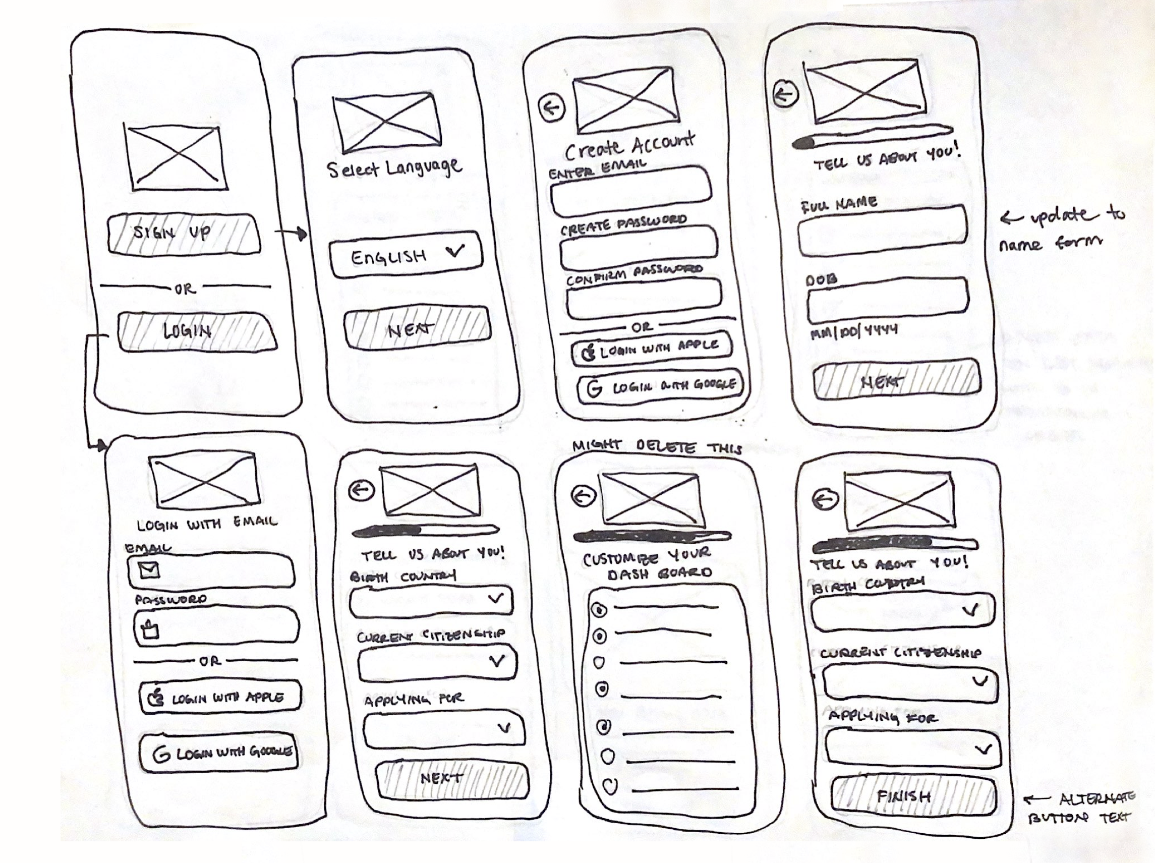
Sketching ideas for the layout of the main screens enabled me to prioritize the key features I aimed to highlight in my design. By conceptualizing the user interface before transitioning to mid-fidelity wireframes, I gained insight into how my initial concepts would integrate into a cohesive design. The wireframe sketches facilitated the mapping of each screen's layout and the identification of potential issues related to user flow or navigation. Given the project's focus on developing a mobile website rather than a mobile app, I encountered specific navigation challenges. While I ultimately implemented a classic mobile hamburger menu, I would have chosen a bottom-screen navigation bar had the project been a mobile application.
Low-Fidelity Wireframes:
When working on my mid-fidelity prototypes, I transformed my initial low-fidelity sketches into digital format. As I continued, I realized that some additional screens were required to fully address the necessary task flows for user testing in the high-fidelity prototype.
Branding
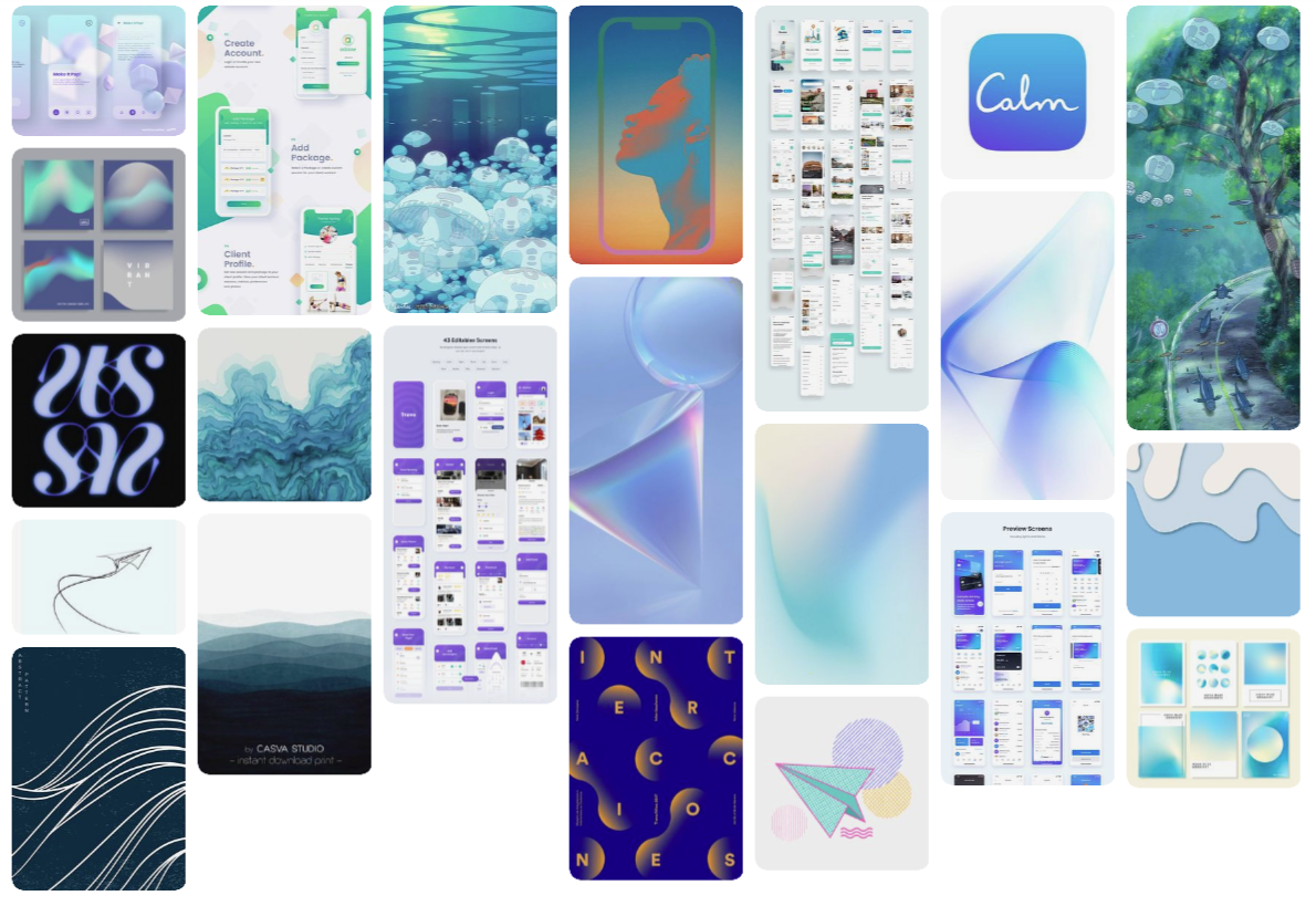
Design Inspiration:
The name Yume means dream in Japanese. I chose it intentionally because the American Dream has been the driving motivation behind countless individuals immigrating to the United States. Additionally, Yume sounds like "you/me," symbolizing a sense of belonging, community, and togetherness.
Themes
Hope
Flow
Calm
Movement
Unity
I drew inspiration from Japanese art, particularly from Studio Ghibli and Miyazaki films, for the brand name.
The color palette I chose is bright yet cool, which creates a calming and inviting atmosphere. I incorporated water imagery and soft gradients to emphasize water and ocean themes.
It's important to note that many immigrants have to travel long distances to get to their destination, some even crossing entire oceans. Interestingly, moving water can have a calming effect, which further adds to the peaceful tone of the design.
In my design approach for the project, I made intentional decisions to create an intuitive user interface that would provide a seamless experience for the user.
I chose to make buttons large with a vibrant green color as it is a color that has been proven to catch the user's attention and encourage action. The use of rounded edges in buttons and form fields was also a deliberate choice that softens the overall look and feel, promoting a calming experience for the user.
The minimal and clean design of icons and font choices was another conscious decision that was made to declutter the appearance and create a more polished and professional look.
High-Fidelity Wireframes
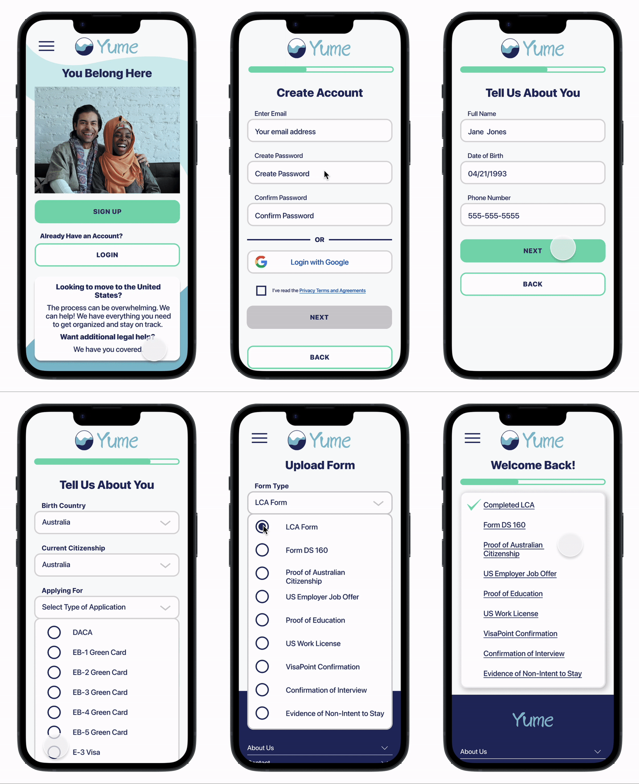
On-Boarding Flow
File Uploading Flow
Finalizing and Submitting your Application Flow
Putting Yume to the Test
Usability Testing and Priority Revisions:
Methodologies: The usability test was moderated and took about 30 minutes per participant to complete.
Goal: Completing user testing will help Yume evaluate the overall success of the product.
Objectives:
Observe how potential users will interact with the interface.
Observe how easily they will be able to accomplish task flows.
Guage the qualitative experience of Yume
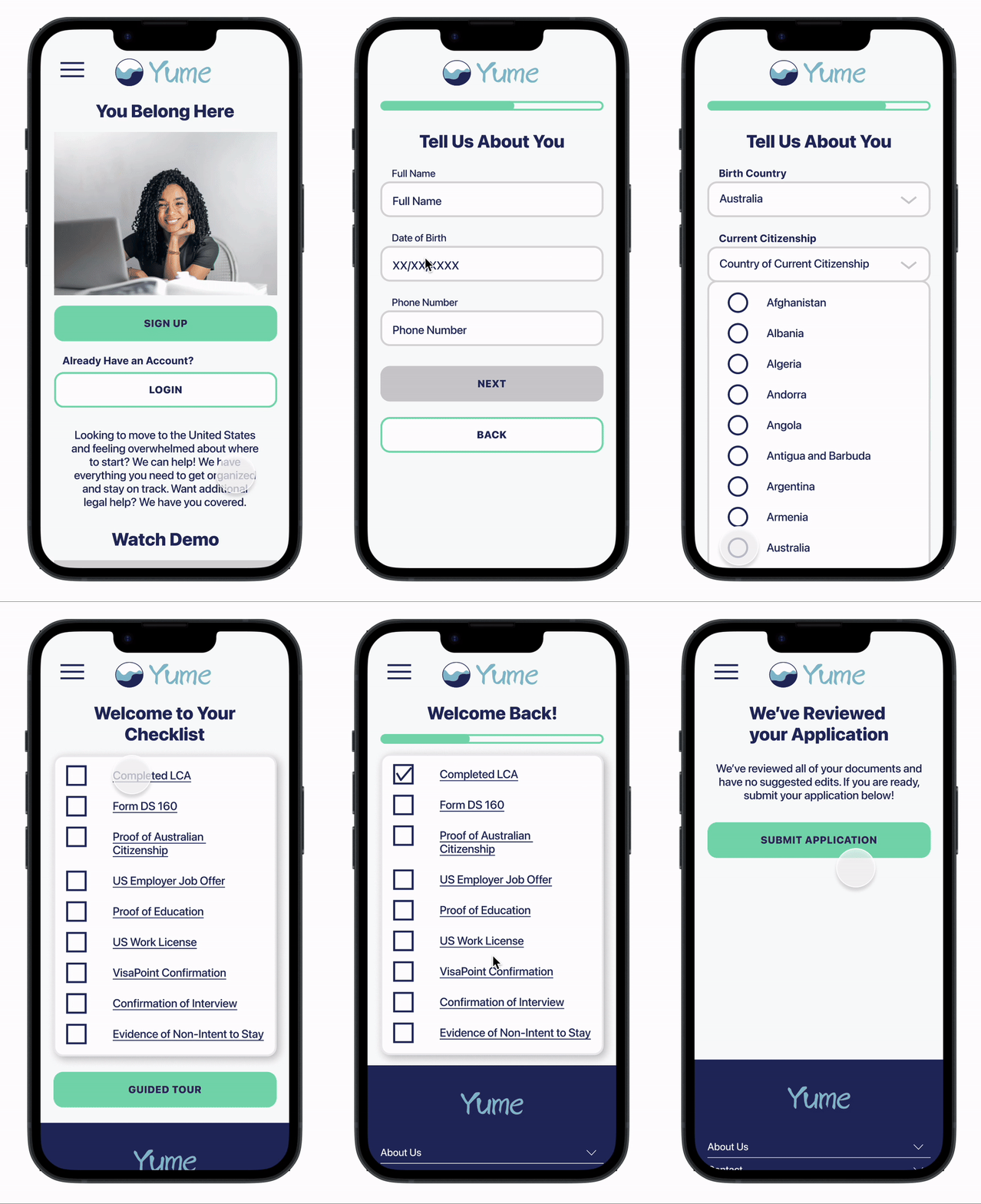
The Prototype Used for Testing:
Users were asked to complete these three tasks during user testing:
Complete On-Boarding
Upload a document to the drive
Submit a finalized application for review
The Results from User Testing:
All users were able to complete the assigned tasks.
All users reported positive feedback about the overall design.
When asked if they would recommend Yume, All users replied affirmatively.
Taking What Was Learned from Testing and Putting it to Action:
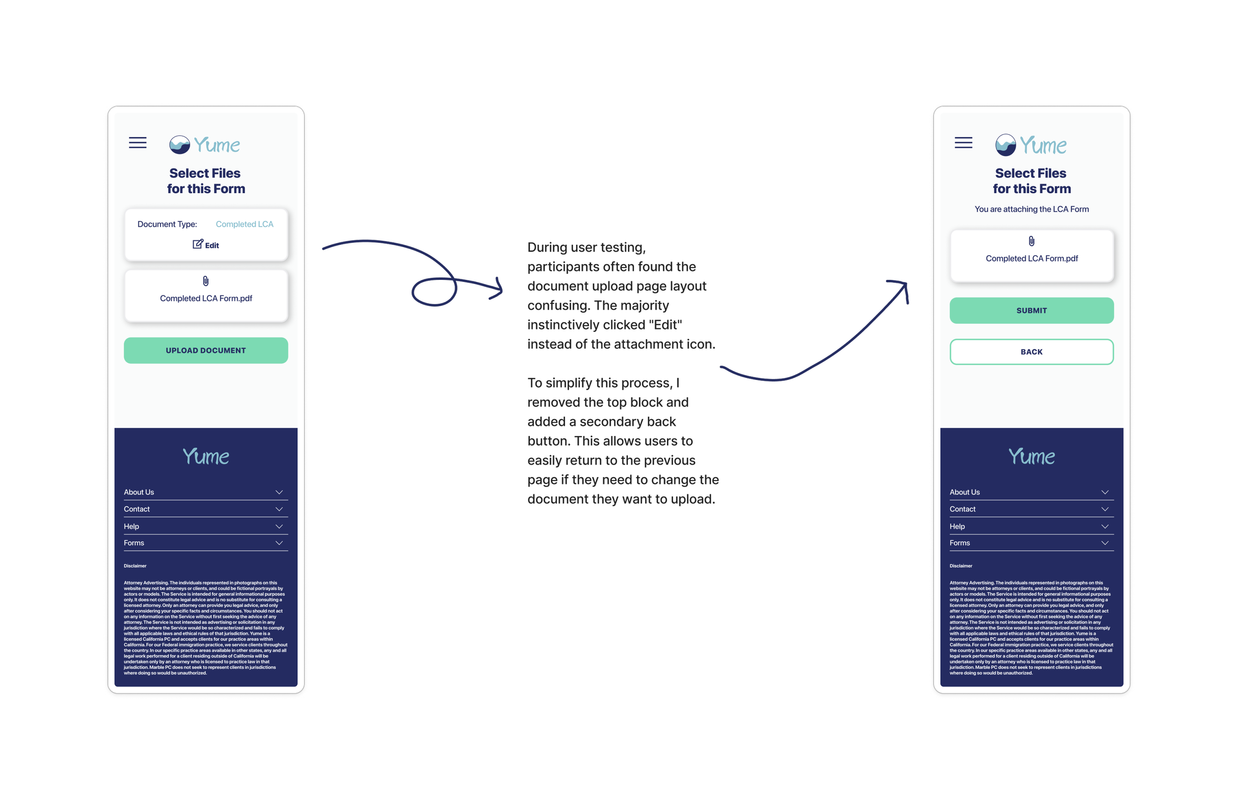
I was able to prioritize what revisions I was going to implement in the next iteration by creating a priority matrix. I weighted all suggestions against scales of importance and difficulty.
For a closer look at the priority matrix and a full list of suggested revisions click below.
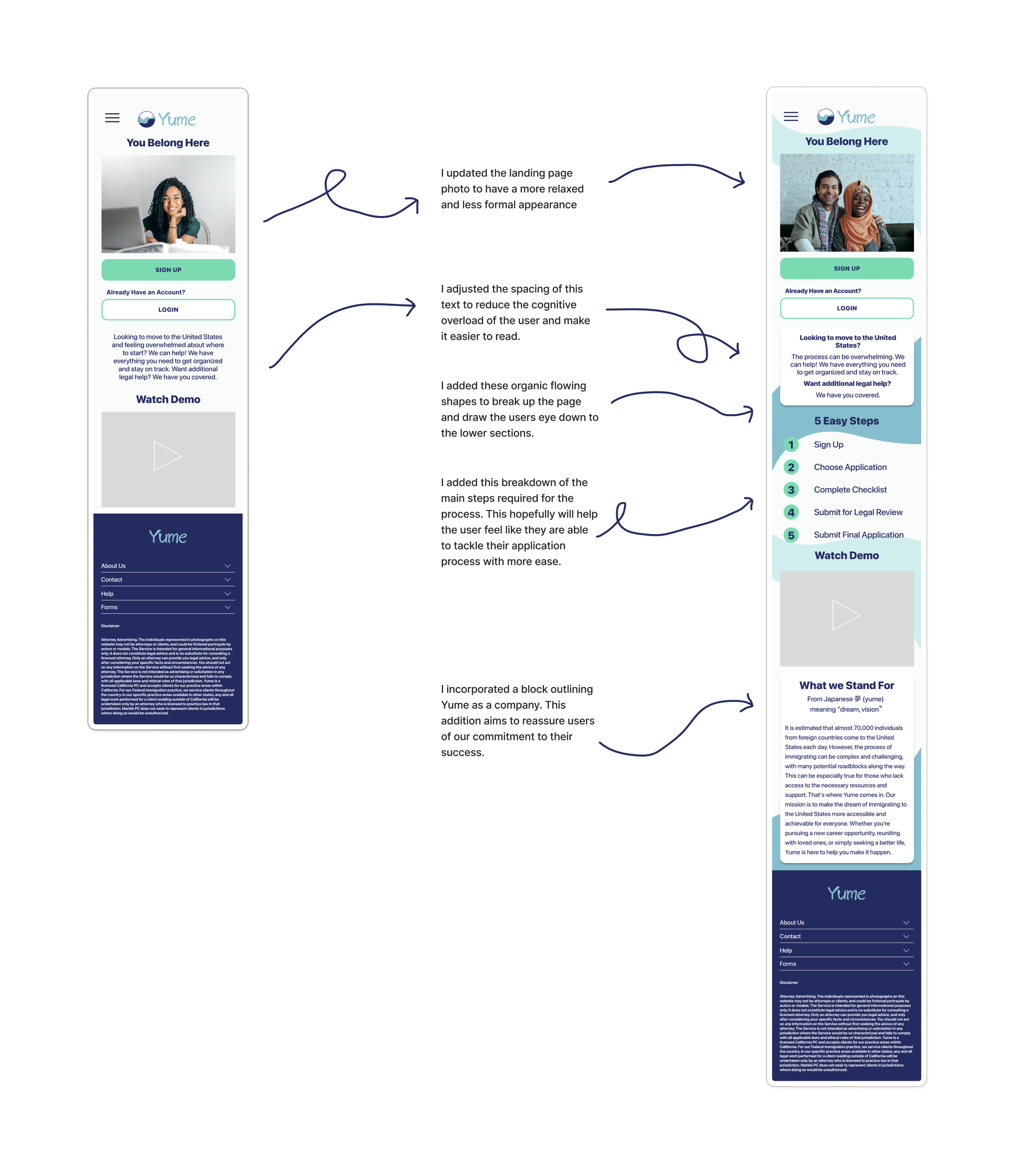
A Closer Look at the Final Iterations:
The Final Prototype:
What I Learned
Every person's immigration story is unique and nuanced.
The current immigration system lacks financial and language accessibility.
Bridging gaps in accessibility greatly increases the likelihood that users will complete their application process successfully.
Moving Forward:
There was an overwhelmingly positive reaction to the product from users in the testing phase. Many expressed wishes for this product to exist and be usable in a real-world setting. I would love to make that a reality.


